The secret tricks hidden inside restaurant menus
 Alamy
AlamyGreat thought and effort go into creating restaurant menus – and there are some very powerful psychological tricks employed to make you choose.
BBC Future has brought you in-depth and rigorous stories to help you navigate the current pandemic, but we know that’s not all you want to read. So now we’re dedicating a series to help you escape. We’ll be revisiting our most popular features from the last three years in our Lockdown Longreads.
You’ll find everything from the story about the world’s greatest space mission to the truth about whether our cats really love us, the epic hunt to bring illegal fishermen to justice and the small team which brings long-buried World War Two tanks back to life. What you won’t find is any reference to, well, you-know-what. Enjoy.
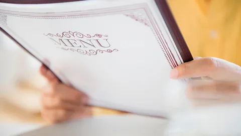
With a theatrical flourish, a sombre, leather-bound document is placed in front of you. Inside, the pages bear a tight italicised script and your eyes are drawn to a couple of items that are embellished with flamboyant descriptions. Then you turn to the waiter and order.
Hopefully a delicious meal is now on its way, but what led you to choose the food you did? Was it simply because you liked the sound of the steak dish you picked or did something else influence your decision?
You may not realise it, but the menu probably played a far greater role than you’d credit. Far from being glorified pricelists, restaurant menus are sophisticated marketing tools that can nudge customers towards certain choices. Restaurant menus can even tell us what to think.
“Even the binding around the menu is passing us important messages about the kind of experience we are about to have,” explains Charles Spence, a professor in experimental psychology and multisensory perception at the University of Oxford. “There are a lot of elements on a menu that can be changed to nudge the customer in one way or another.”
Even simple tweaks to the order of items on the menu or the typeface used can have a significant impact on people’s choices. There is now an entire industry known as “menu engineering”, dedicated to designing menus that convey certain messages to customers, encouraging them to spend more and make them want to come back for a second helping.
“For a large chain that might have a million people a day coming into their restaurants around the world, it can take up to 18 months to put out a menu as we test everything on it three times,” says Gregg Rapp, a menu engineer based in Palm Springs, California, who has worked on menus for small neighbourhood cafes and multinational giants during his 34-year-long career. “Customers only spend a few minutes looking at the menu, so we want them to use this time efficiently. If they can find an item they want quickly, then they can spend the extra time looking at other items they might order.”
 Alamy
AlamyPerhaps the first thing a customer will notice about a menu when the waiter hands it to them is its weight. Heavier menus have been shown to suggest to the customer that they are in a more upscale establishment where they might expect high levels of service.
A sweet type
The font the menu is written in can convey similar messages; for instance an italic typeface conveys a perception of quality. But using elaborate fonts that are hard to read could also have another effect – it could alter how the food itself tastes.
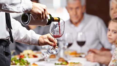
A study conducted by researchers in Switzerland found that a wine labelled with a difficult-to-read script was liked more by drinkers than the same wine carrying a simpler typeface. Spence’s own research has also found that consumers often associate rounder typefaces with sweeter tastes, while angular fonts tend to convey a salty, sour or bitter experience.
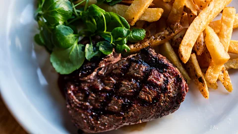
“Restaurants can play with this to nudge people towards ordering more expensive dishes,” explains Spence, whose recent book Gastrophysics: the New Science of Eating, looked at the issue in detail. But the language on the menu can be just as important, he adds. After all, a “grass-fed Aberdeen Angus fillet with thick-cut rosemary fries” sounds much more appetising than a simple “steak and chips”, does it not?
Indulgent descriptions
This sort of descriptive language is widely used by the food industry. The British retailer Marks & Spencer famously uses long-winded, and often sensual, descriptions of the food it sells in its adverts, to convey the impression of the quality of its products.
“This is not just a pudding,” one advert declared. “This is a melt in the middle, Belgian chocolate pudding served with extra thick Channel Island cream.” It saw sales rocket by 3,500%.
 Alamy
AlamyWords have tremendous power over our food choice. Giving dishes descriptive names can increase sales by up to 27% in some cases. This becomes particularly effective if the description attaches some provenance to the ingredients – “Grandma’s home-baked zucchini cookies” sound much more appealing than “courgette biscuits”.
“Naming the farmer who grew the vegetables or the breed of a pig can help to add authenticity to a product,” says Spence. “Consumers take that as a sign of quality, even it has been made up. Sensory words can also make a dish seem more appealing.”
A recent study published by scientists at Stanford University, in California, found that vegetables that have been given indulgent sounding descriptions – such as “dynamite chili”, “sweet sizzling green beans”, and “crispy shallots” – on a cafeteria menu were picked 23% more often because it made them sound more exciting and flavoursome.
The words used to describe a food, however, may do far more than make them sound enticing – they can make our mouths water. A study from the University of Cologne in Germany last year showed that by cleverly naming dishes with words that mimic the mouth movements when eating, restaurants could increase the palatability of the food. They found words that move from the front to the back of the mouth were more effective – such as the made up word “bodok”.
The effect seems to even work when reading silently, perhaps because the brain still stimulates the motor movements required to produce speech when reading. This masticatory effect, the authors suggest, gets our saliva glands working.
Putting brand names into dish titles is also an effective strategy for many chain restaurants, as are nostalgic labels like “handmade” or “ye olde” according to Brian Wansink from the Food and Brand Lab at Cornell University. A dose of patriotism and family can also boost sales.
Letter costs
But beware of menus with rambling, adjective-filled descriptions. There may be a more mercenary reason for verbose dish summaries – they can made the food seem like better value for money.
Dan Jurafsky, a professor of computational linguistics at Stanford University, performed a study that analysed the words and prices of 650,000 dishes on 6,500 menus. He found that if longer words were used to describe a dish, it tended to cost more. For every letter longer the average word length was, the price of the dish it was describing went up by 18 cents (14p).
“The more description you have the higher the value of the item and the lower the price seems in the customer's head,” says Rapp. “If you just write ‘New York Steak $43’, it can seem expensive, but if you write a paragraph about it how it is a prime cut, where it comes from and how long it has been aged for, then it can seem less expensive.
 Alamy
Alamy“The key though, is ensuring the descriptions are something the restaurateur believes in otherwise it can just seem contrived. The story behind the food has to be personal and true.”
But the words on the menu are not the only thing sending you signals. The colours it uses could also be having an impact. Certain colours like green are often used to imply the food is healthy and fresh, while orange is thought to stimulate the appetite, according to Aaron Allen, a global restaurant consultant, based in Orlando, Florida who is an expert on the psychology of menu design. Red suggests a sense of urgency and perhaps draws attention to dishes the chef most wants you to buy – probably because they have the biggest profit margin.
Restaurants can use other tricks though to tempt diners into buying more expensive dishes. Perhaps the most common is to drop the price by a cent (or penny), as paying $5.99 for a dish makes it seem cheaper than a nice round $6. This is widely used across the retail industry and most consumers are wise to it. But restaurants have another trick up their sleeve – dropping the dollar or pound sign altogether.
“The dollar sign is a pain point that reminds the diner that they are spending money,” says Allen. “By just using the figure, or even better, writing it out in words, it can reduce that pain.”
Prime real estate
Allen even says simply reordering the dishes on the menu can also have dramatic impacts. By placing the most expensive item at the top of the menu, it makes those that come after it seem far more reasonably priced.
“We can increase the profits of a restaurant by thousands simply by rearranging the items on the menu,” says Allen.
Research using eye-tracking technology has shown that customers read menus in very predictable ways. They will often read a menu much like they would a book, but Rapp’s own work has shown there are some hotspots on the page.
“When we do eye tracking on a customer with a menu in their hand, we typically see hotspots in the upper right hand side,” he says. “The first item on the menu is also the best real estate.”
Some large restaurant chains are even using big data from hundreds of thousands of sales to see what impact moving something on a menu can have.
But filling a menu with too many items can actually hamper choice, according to menu design experts. They say offering any more than seven items can overwhelm diners. To overcome this, they tell restaurants to break down their menus into sections of between five and seven dishes.
“More than seven is too many, five is optimal and three is magical,” says Rapp. There is some research to back this up – a study from Bournemouth University a few years ago found that in fast food restaurants, customers wanted to pick from six items per category. In fine dining establishments, they preferred a little more choice – between seven and 10 items.
Picture this
There are other ways menus can draw your attention to particular dishes, rather than relying upon the path your roving eye takes. Boxes around certain dishes – often high-priced options like steaks – can be particularly effective.
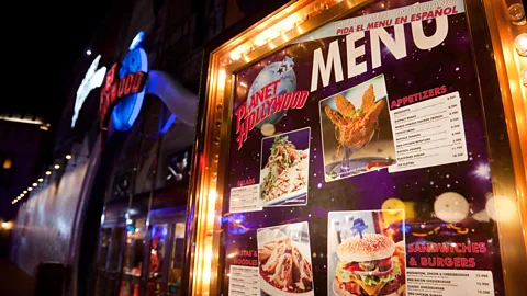
Some restaurants also use logos that might signify a new time or a seasonal dish to draw a customer towards those choices. Images can also help, but it depends on where you are eating. In many parts of the world, pictures of food tend to be associated with cheaper fast food, and can put off the more snobby eater.
 Alamy
Alamy“The problem with pictures is that the brain will also taste the food a little bit when it sees a picture, so when the food comes it may not be quite as good as they imagined,” warns Rapp. “Often the food doesn’t come out looking as good as it does in the pictures too.”
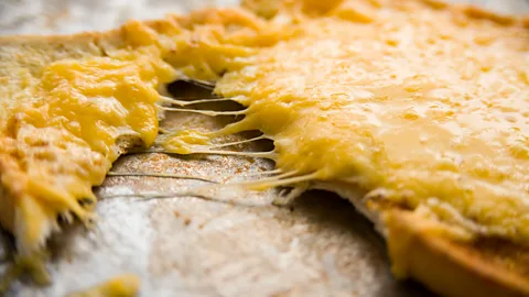
That is a common problem that anyone who has eaten in certain fast food burger restaurants will have experienced. The oozing cheese, shining meat juices and running egg yolk on the menus are rarely reflected in the untidy pile of meat, salad and bread that is served.
But the power of so-called “food porn” to set our mouths watering could soon become far more important as restaurants, and menus, move into the digital age. Diners are increasingly able to order their food online through their mobile phone or on interactive displays at their table.
“Our minds find protein in motion – oozing cheese and dribbling yolk, very attractive,” says Spence. “As menus go digital, there will be more opportunity to show this off with videos and animations.”
Menus of the future could become so sophisticated that they may even know what you want to order before you even realise it yourself, argues Allen. A couple of years ago Pizza Hut began testing eye-tracking technology to predict what diners might want as they scan through 20 different toppings before offering a likely combination to the customer.
Allen says artificial intelligence and machine learning could transform this even further – algorithms could look at your previous choices when you last visited a restaurant and suggest other items you might like.
“The restaurant industry has probably spent tens of billions of dollars over the years trying to understand menu design, menu engineering and psychology,” he says. “But the opportunities presented by the fourth industrial revolution are huge. Imagine being able to order a meal that has been designed to include your favourite foods with a single click.”
Are you still convinced the Angus-fed beef fillet was really what you wanted to order?
--
If you liked this story, sign up for the weekly bbc.com features newsletter, called “The Essential List”. A handpicked selection of stories from BBC Future, Culture, Worklife, and Travel, delivered to your inbox every Friday.
