How six colours update the iconic London Tube map

 TfL
TfLChanges to six lines of the London Overground mean an update to a 1931 design that went global and became a gold standard, even sparking an uproar in 2009 when the River Thames was taken off the map.
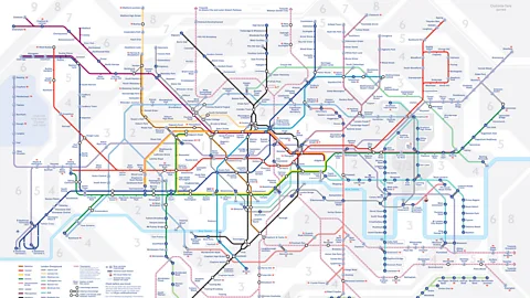
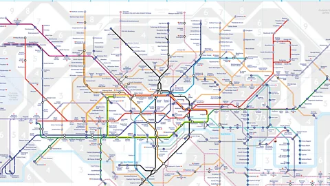
New names for the six lines of the London Overground have been revealed, with each given its own colour – redesigning the city's iconic Tube map. The changes are intended to make it easier for passengers to navigate the network, by giving the routes distinct identities (the Overground was previously all one colour, orange).
The six new names are the Lioness line, the Mildmay line, the Windrush line, the Weaver line, the Suffragette line and the Liberty line – each chosen because of particular local histories.
It marks the most recent update to a map that arguably helped to shape the city itself.
The first section of the London Underground opened in 1863. Over the following decades, a number of Tube maps – showing an uncoordinated network of lines owned by different companies – were published in increasing, unwieldy profusion. None looked like the iconic map so beloved by visitors and locals today.
The fact that there were so many Underground maps before Harry Beck’s famous 'diagram' of 1931 – the blueprint of today’s maps – was proof of a problem that took many years and a great deal of ingenuity to solve. After all, how could a designer fully represent lines that criss-crossed a few squares miles of central London yet also stretched across what, until as late as 1900, had been farmlands, markets gardens and remarkably remote Middlesex villages? And how could it all fit onto a single map – one that could be folded neatly into a coat pocket?
Size matters
The sheer spread of the Underground network made mapping it problematic. Even in central London, there were stations like Covent Garden and Leicester Square just 200m from each other, while others like Kings Cross and Farringdon were 1.15 miles (1.85km) apart. Outside the centre, the Underground stretched as far as Verney Junction and Brill in Buckinghamshire, rural outposts 50 miles from Baker Street. As maps of the time took their cue from historical precedent, it was thought that these geographic distances had to be represented to scale.
But by 1930, it was clear that any map trying to plot the entire Underground network geographically was going to be too big to handle – especially in the busy confines of a Tube station, where shoulder room was precious. So Underground maps of the time tended to concentrate on lines in central London.
They allowed lines farther afield to drop off the edge of the city, as if they were ships sailing through the mermaid- and monster-populated seas of an unenlightened, flat world.
Many of these early, artist-designed maps are utterly charming and, rightfully, collector’s items today. They were, however, neither comprehensive nor even particularly useful.
Map or Mondrian?
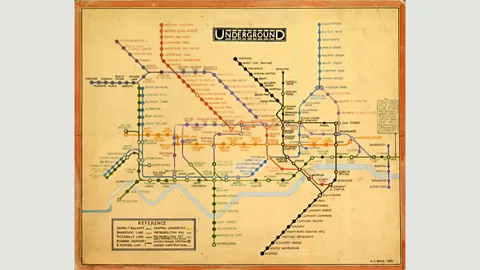
In 1931, Harry Beck, a young engineering draughtsman who had joined the Underground Group’s Signal Engineer’s Office in 1925, came up with a solution. It was to become not just a useful tool for Londoners and visitors to the capital, but a much-loved design in its own right. It remains the basis for the maps used today.
 TfL from the London Transport Museum collection
And yet, when Beck first presented his 'diagram' to Underground management, they were unsure. Lines running horizontally, vertically or at 45-degree angles were plotted on a grid. Eschewing geography, it looked like a cross between an electric circuit diagram and a Mondrian painting.
While it was no longer possible to tell the distance or precise geographic location of stations at a glance, Beck reasoned that this was unimportant. What passengers needed to know was how to get from one station to another as efficiently as possible and where to change between lines.
In 1933, the Underground, city buses, trams, trolleybuses, river buses and Green Line coaches were brought together under the umbrella of a new public corporation: the London Passenger Transport Board. With a spirit of modernisation in the air, the time was right to see how the public would respond to Beck’s radical 'diagram'. After a test run of 500 copies were distributed from a select few stations in 1932, 700,000 copies of the map were printed in 1933. It proved an instant success – a reprint had to be ordered within a month.
Yet the map wasn’t perfect. Beck had been unable to include the western extremities of the District Line (shown in green), or the rural adventures of the Metropolitan (magenta) beyond Rickmansworth. These design puzzles were solved over many years as Beck improved his map. His last version was printed in 1960 when he fell out with London Transport. Its publicity officer, Harold Hutchinson, took over the design task.
Feeling a sense of ownership and averse to seeing his design changed by third parties, Beck fought a long legal battle with London Transport. He abandoned this in 1965 but worked on the map privately, along with designs for the Paris Metro he had begun decades earlier, until his death in 1974.
 TfL
TfLSince 1986, the design has been a corporate task, with names of individual designers – aside from Beck, who remains credited as the originator – subsumed in this never-ending enterprise. The map has long gone global, too. Not only has it inspired countless Metro maps across continents, but it is also a staple of t-shirts, coffee mugs and countless other souvenirs.
Cry me a river
That means that, when big changes are made, everyone notices. Over the years, lines have been added including the Docklands Light Railway, the Overground network, Crossrail and the Emirates Air Line cable-car linking Greenwich Peninsula with Royal Docks. Then, in 2009, the River Thames was removed from the map. This had long been its one defining geographic element. When it went, there was a public outcry and negative media attention from around the world.
The Thames was back on the map within months, although collectors of Underground maps – of whom there are many – will prize the Thames-less map, much as stamp collectors treasure Edward VIII postage stamps among other design rarities.
In 2006, Beck’s map came second in BBC2’s Great British Design Quest, when more than 200,000 viewers chose between such compelling designs as the Mini, E-Type Jaguar and the album sleeve of Sergeant Pepper’s Lonely Hearts Club Band. Beck’s map came second, beaten to the number-one slot only by Concorde, perhaps the most beautiful aircraft of all time.
 The Great Bear, 1992/Simon Patterson/Victoria & Albert Museum
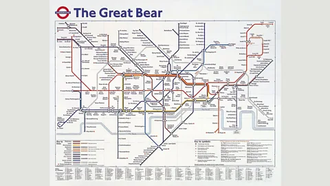
Beck’s map and its successors have inspired artists, too. David Booth’s The Tate Gallery by Tube (1986), a poster for London Underground stations, showed Tube lines squeezed from tubes of paint; since 1992, the Tate Modern has displayed The Great Bear by Simon Patterson, with station names replaced by a plethora of artists, explorers, scientists, actors and writers.
It isn’t only artists who have been inspired by the map. For generations, London schoolchildren, trying to relieve the monotony of their daily commute, have translated station names into foreign alternatives – with Kings Cross, for example, becoming 'Koenigkreutz'. And many have been able, thanks to the graphic clarity of the Underground map, its bright colours and peerless Johnston typeface, to memorise every station on the Underground network.
From games and memory feats to artworks and souvenirs, Beck’s diagram imprinted a very particular map of London on the minds of millions. More than 80 years on, it remains the gold standard by which new Metro maps are judged.
If you liked this story, sign up for The Essential List newsletter – a handpicked selection of features, videos and can't-miss news delivered to your inbox every Friday.
