Coronavirus: The world in lockdown in maps and charts
 BBC
BBCCoronavirus has now infected more than one million people worldwide, but its impact extends far beyond just those who have had it.
Even the frequency of use of the word "unprecedented" is unprecedented at the moment. According to Google Trends it's been used three times more over the last two weeks than the highest point recorded previously.
As governments around the world have enacted new measures and given official advice, we take a look at the impact that it's had on people and the world around them.
How the world shut down
The approaches to dealing with coronavirus across the world have been wide-ranging to say the least.
In Colombia the days that you're allowed to leave the house depend on the number of your national ID card; in Serbia a designated dog-walking hour was introduced; and in Belarus the president has gone against medical advice, recommending vodka and saunas as a way to stay safe.
Some of the more common approaches have seen governments issue recommendations on social distancing for part or all of the country, while others have acted to restrict all non-essential internal movement. The latter is often called a lockdown.
When the virus was first identified in China in late 2019, lockdown seemed extreme.
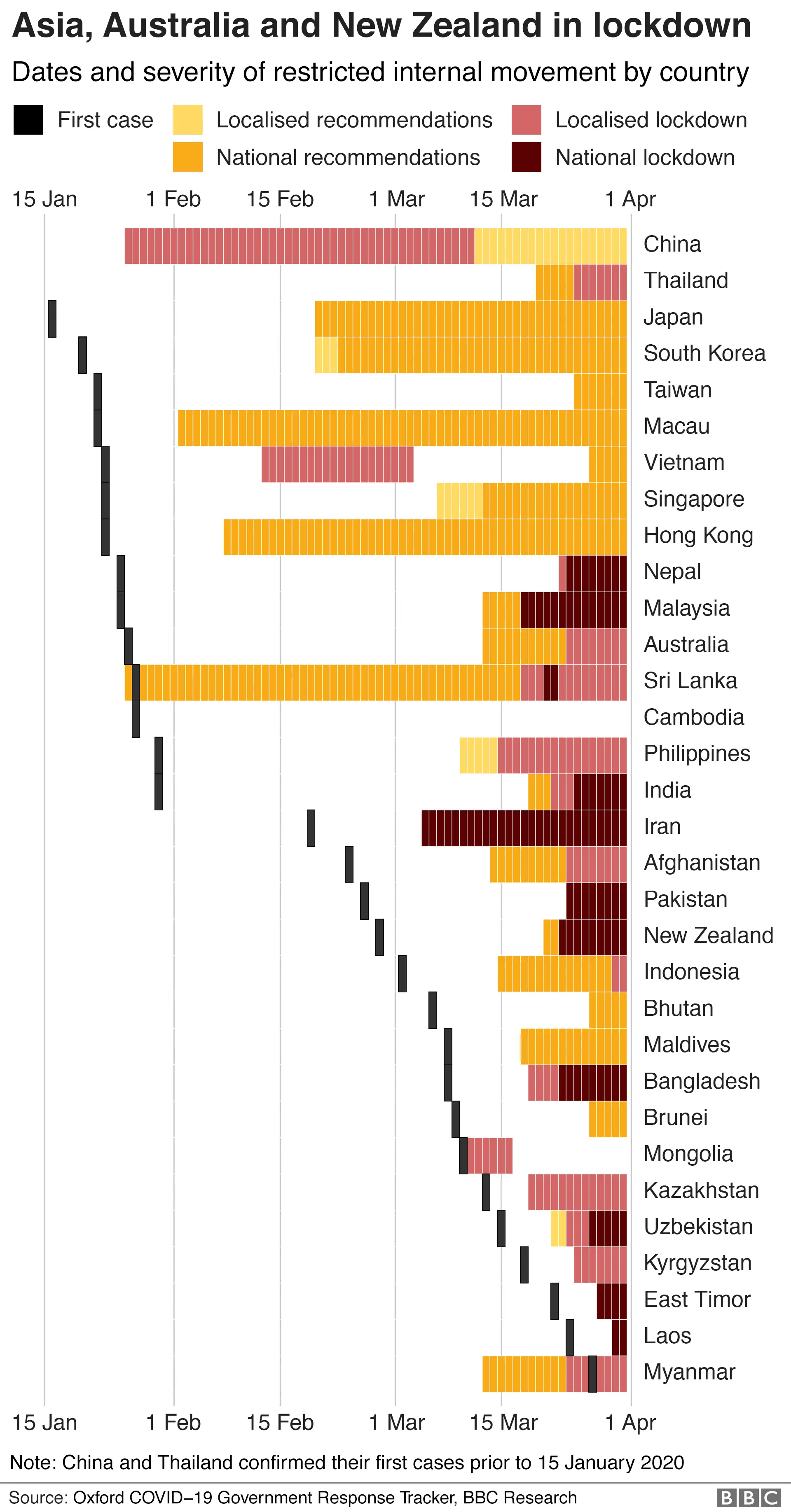

But as the outbreak has spread around the world, it has become more difficult to manage. More countries have opted to take the strictest measures possible to contain it.
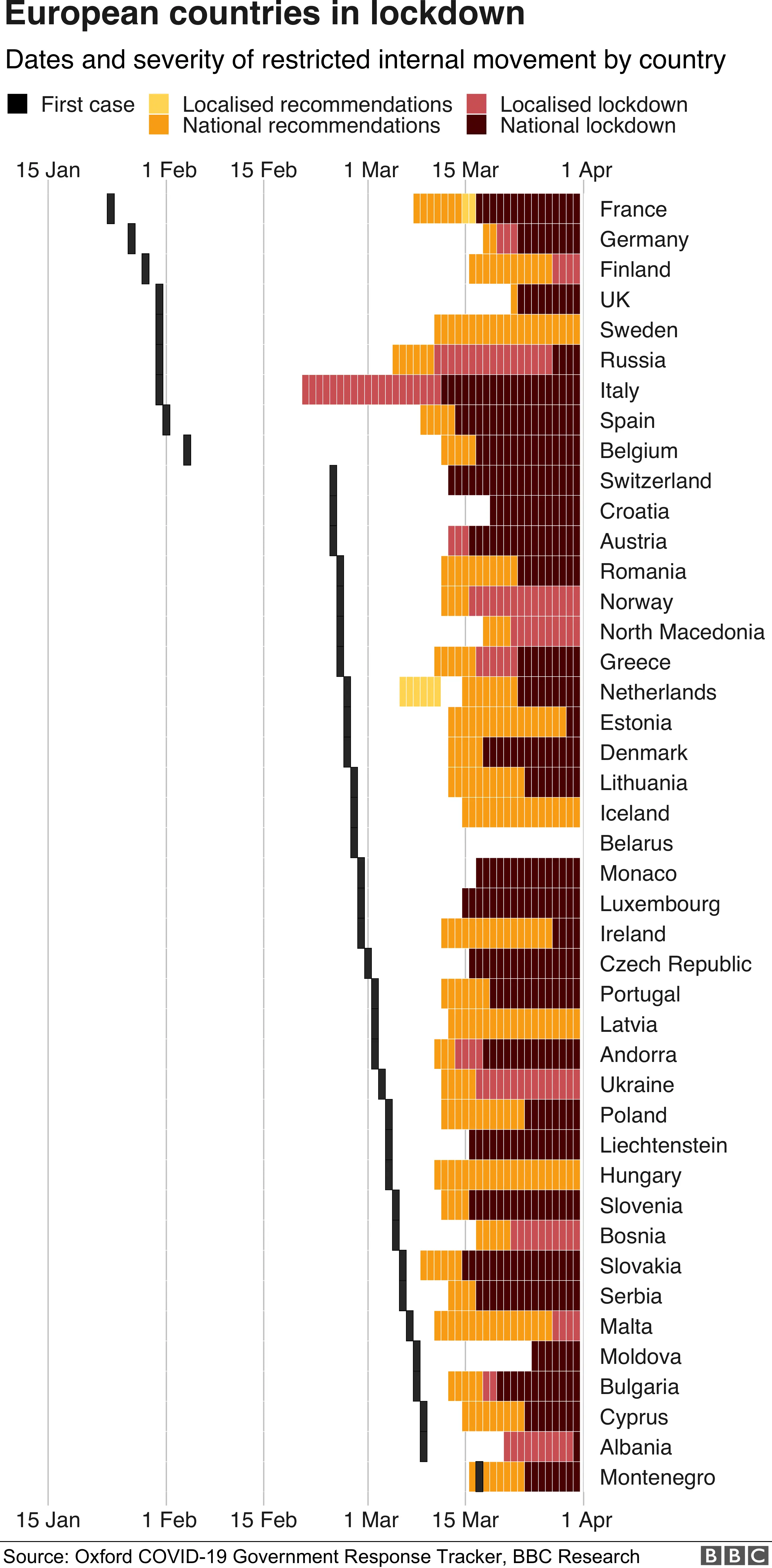
Well over 100 countries worldwide had instituted either a full or partial lockdown by the end of March 2020, affecting billions of people.
And many others had recommended restricted movement for some or all of their citizens.


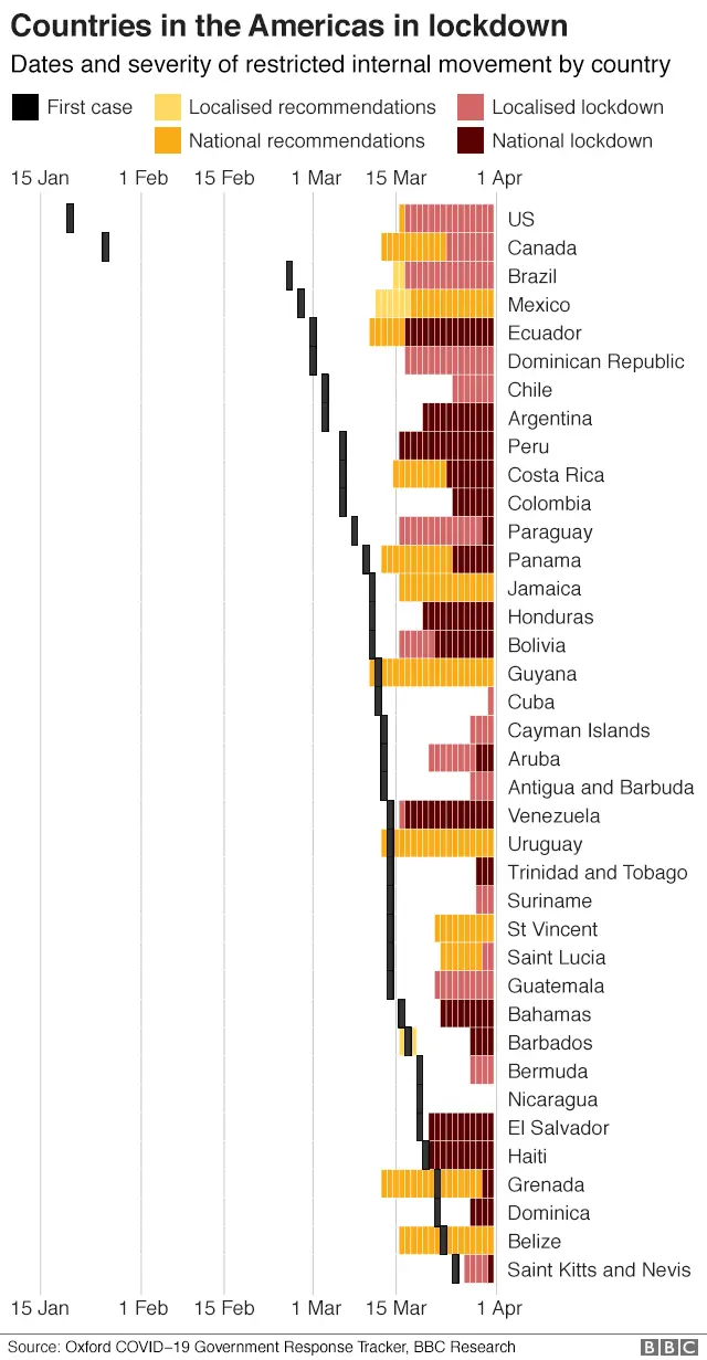
In regions that have only recently confirmed their first cases of coronavirus, many countries appear to be learning from their Asian and European counterparts.

Governments seem to be acting faster and more strictly in Africa as well.


China has managed to ease its restrictions after passing through the worst period of climbing cases and deaths, but life is still far from normal.
The rest of us may have a long way to go.

Flight risk
When the virus first appeared, several countries brought in initial restrictions on flights from China, or required visitors from at-risk areas to be quarantined on arrival.
After it had been declared a pandemic by the World Health Organization, on 11 March, there were more all-encompassing measures.
President Trump blocked all non-essential arrivals to the US from the European Union on 15 March, and a day later the EU did the same to all visitors from outside the Schengen free-travel zone.
By the end of March, air traffic from some of the world's biggest airports had dropped to a fraction of what it was at the same time last year, or even what it was at the start of this month.
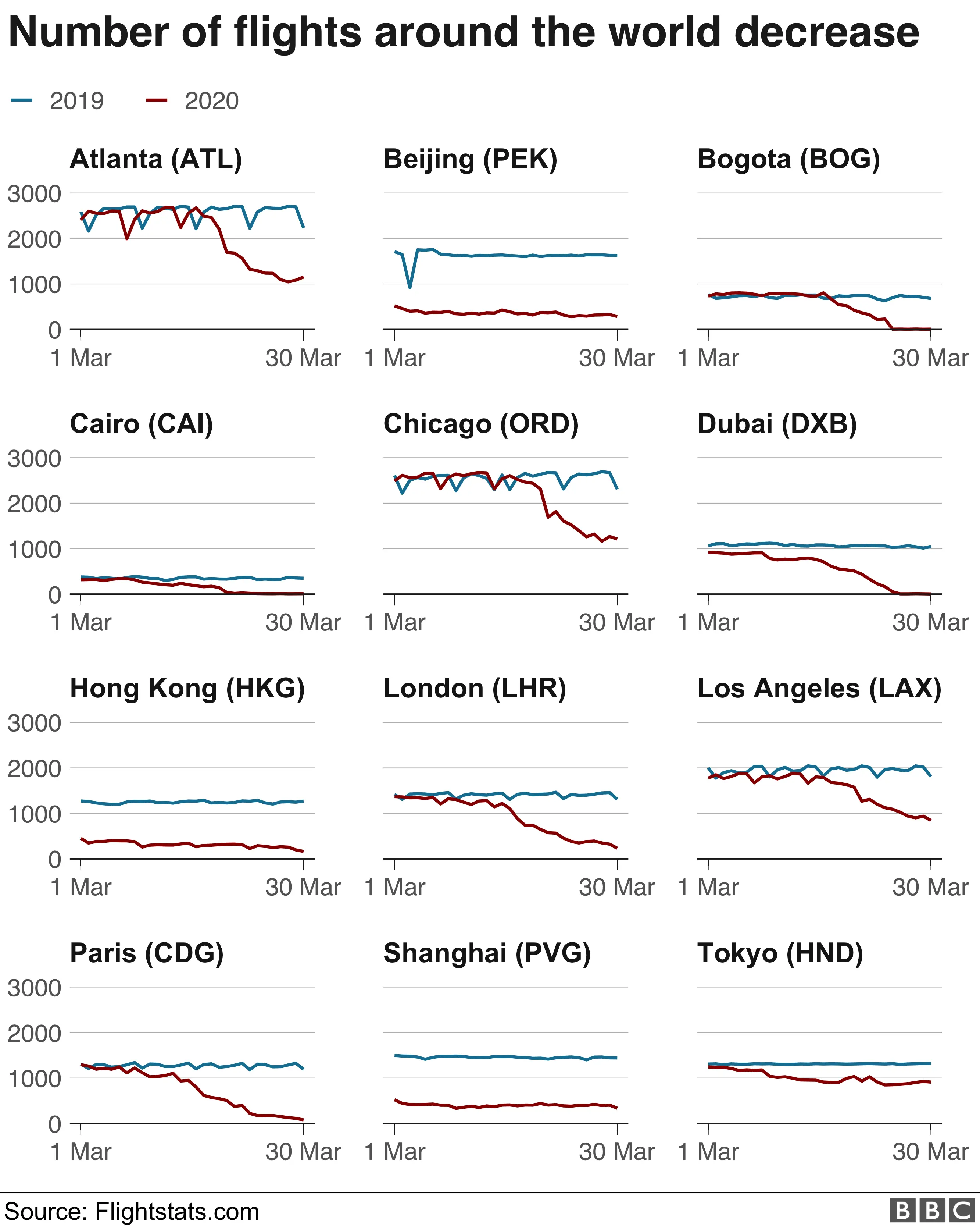

The number of commercial flights last month was down by more than a quarter globally, according to flight tracking service Flightradar24.
In the final week of March, as more and more countries introduced travel restrictions to try to contain the virus, traffic declined 63% from the same period last year.
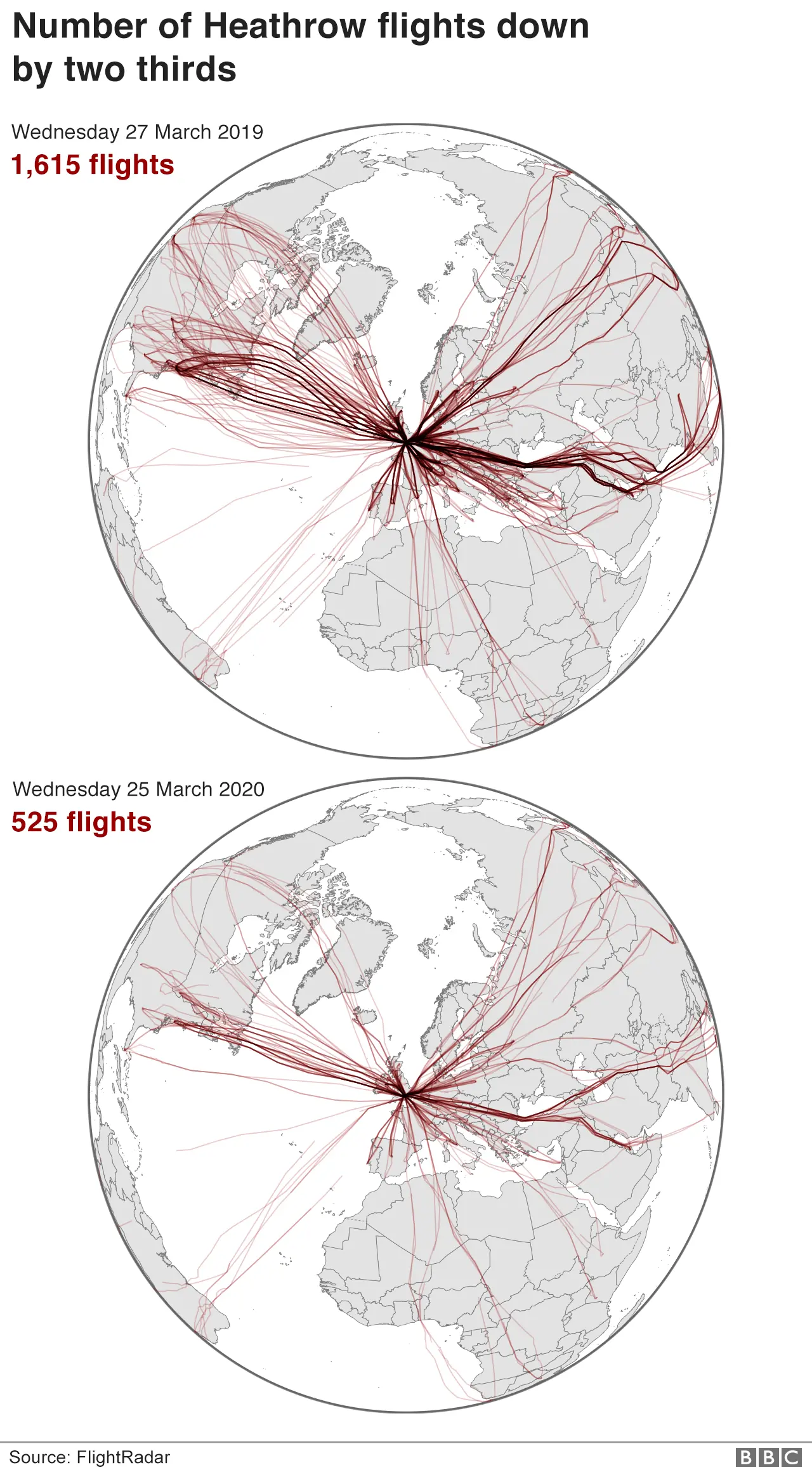
On 25 March, Heathrow - one of the busiest airports in the world serving about 80 million passengers per year - recorded more than 1,000 fewer flights compared with an equivalent day in 2019.
 BBC News
Getting around
It's not just getting from city to city. Travel within major cities across the globe has ground to a halt as restrictions on movement and social contact have come into force.
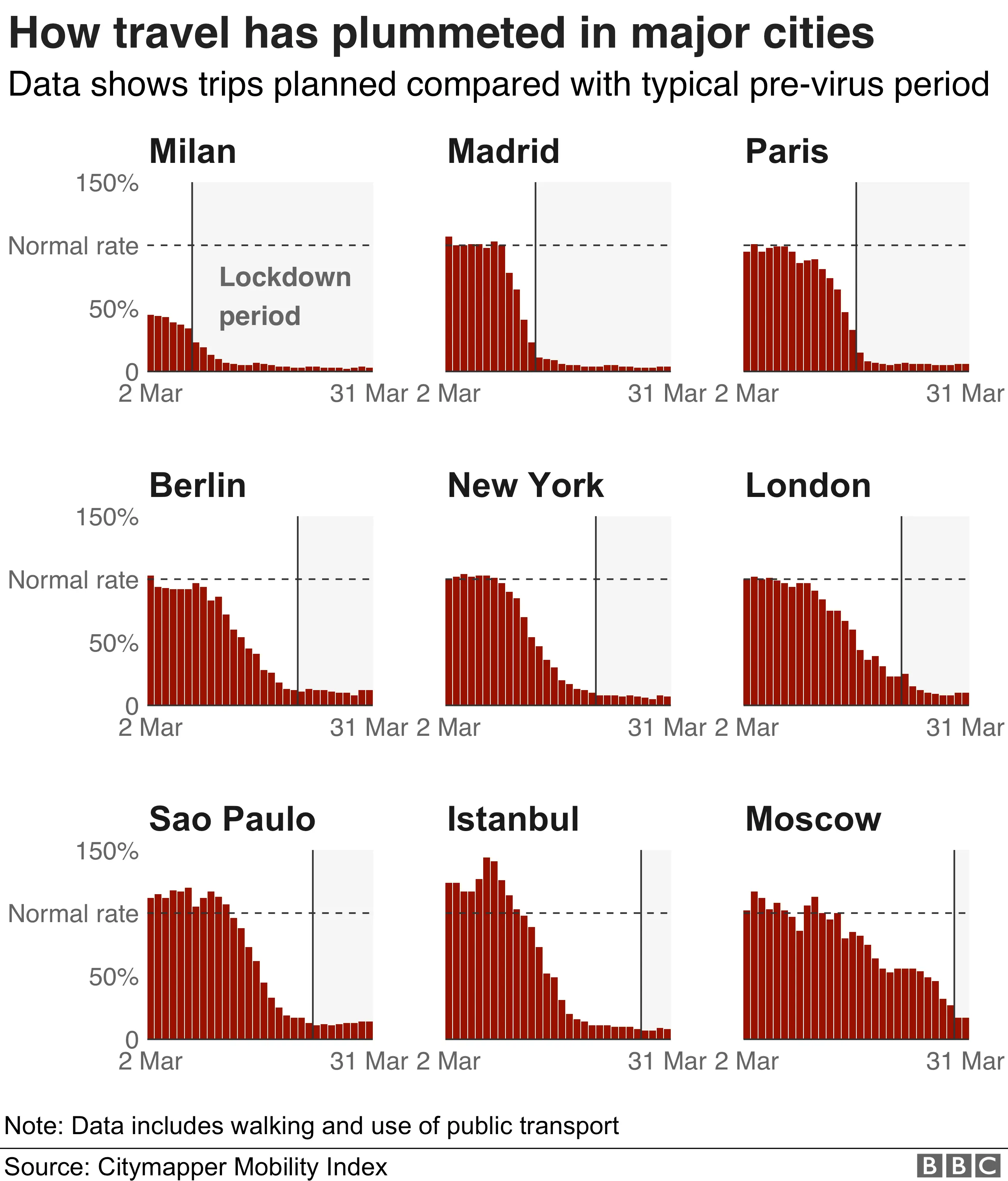
As of 31 March, residents in cities like Madrid, Paris, London and New York were making fewer than one-tenth as many journeys using the app as they did normally, according to data from travel app Citymapper.
In Milan in northern Italy, which has been locked down for several weeks now, only 3% of trips were being planned via the Citymapper mobile app, compared with before the outbreak.
The data also suggests that people cut down on travel in the days leading up to government-enforced shutdowns.
For example, the partial lockdown in Sao Paulo, Brazil's most populous city, came into place on 24 March but trips had already declined sharply the week before.

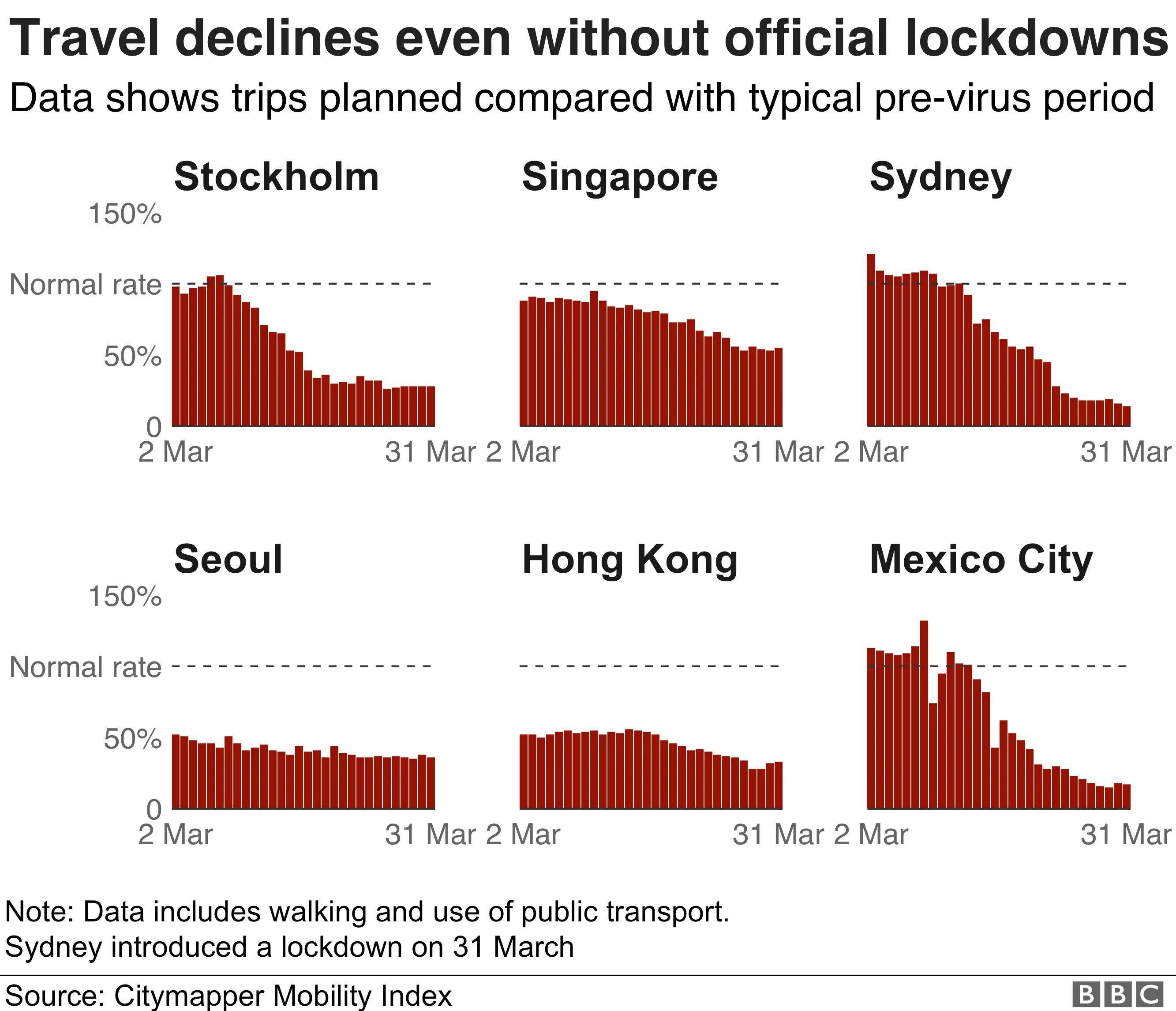
Even in cities where authorities have issued recommendations on social distancing and refrained from imposing strict lockdowns, it appears that people are still restricting their travel.
ln Stockholm, Sweden, where the government has avoided draconian measures, issuing guidelines rather than strict rules, the Citymapper data suggests planned trips - which can include both walking and public transport - fell by 70%.
Stockholm's public transport company reported last week that passenger numbers on subway and commuter trains had halved.
Movement is also below normal rates in some of the Asian cities that Citymapper collects data for, like Hong Kong and Singapore, which have not enforced the type of shutdowns seen elsewhere.
The South Korean capital Seoul hasn't come to a standstill like European capitals, despite facing huge numbers of coronavirus cases - a sign of the country's decision to focus on widespread testing and contact tracing rather than social distancing.

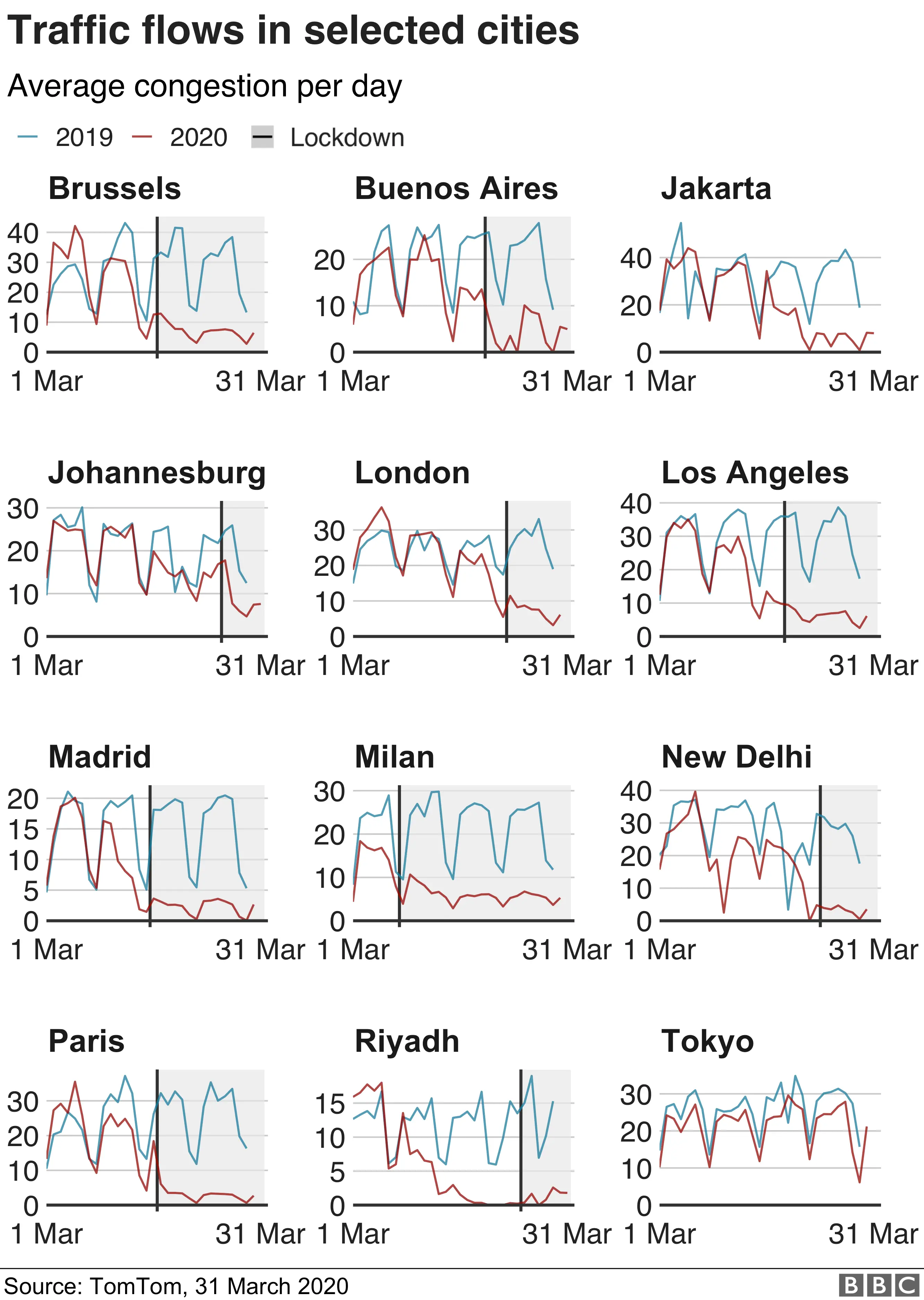
We see the same behaviour with people on the roads. Major cities around the world were already becoming steadily less busy before official lockdown measures came in, congestion data from location technology specialists TomTom shows.
In Tokyo there hasn't been an official lockdown yet, but schools have been shut since the beginning of March. That, and a lack of tourists, could explain why traffic there has been marginally below last year's levels without the sharp downturn obvious elsewhere.
In Jakarta, Indonesia, where there has also been no official lockdown, congestion has already dropped to almost zero - similar to Los Angeles and New Delhi which shut down on different dates.
The congestion score in the graphic below is an indication of how much longer it would take to make a journey through the city compared with when there is no traffic at all. A rating of 50 means that a trip will take 50% more time than it would if the roads were completely free, for example, so a half-hour drive would become 45 minutes. The regular low points on the chart generally come at weekends.

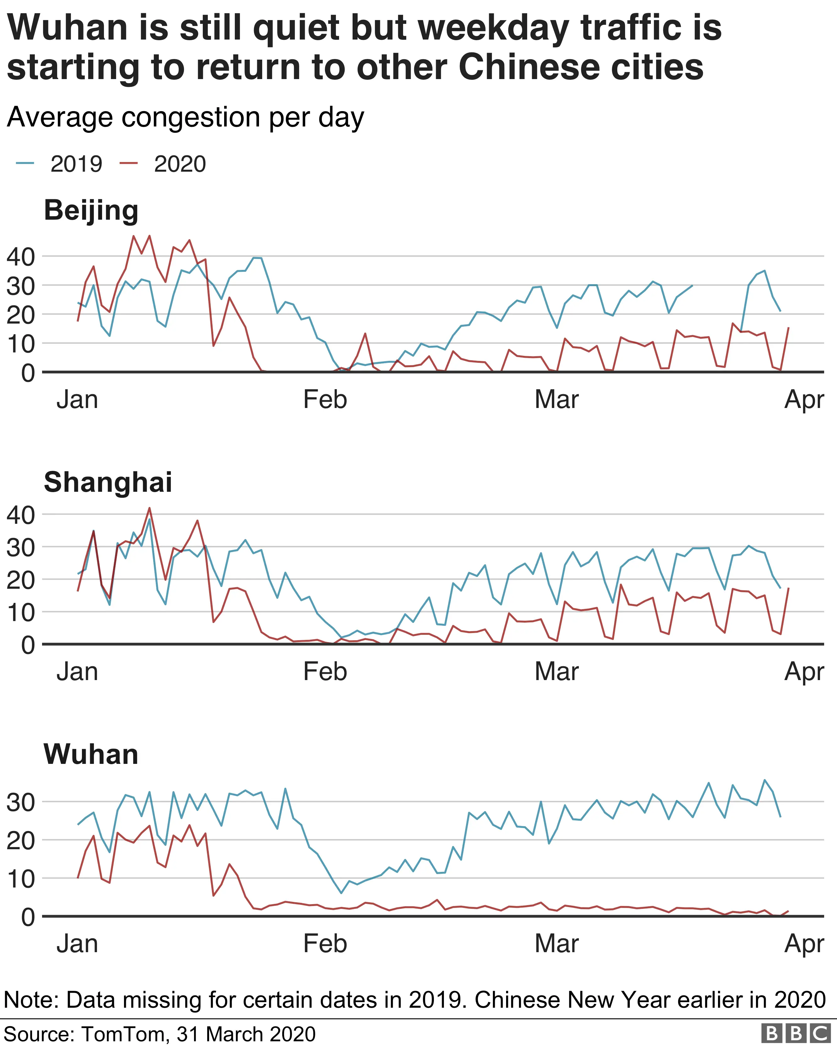
In China there are signs that things are beginning to get back to normal. Traffic levels are back to about half the 2019 level in Beijing and Shanghai but have been steadily growing since the beginning of February following extended Chinese New Year celebrations from 25 January.
In Wuhan, where the outbreak originated, traffic levels are still next to zero compared with last year.


The environment
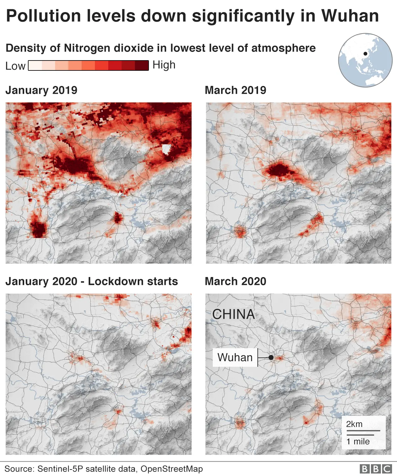
One of the few positive effects of the shutdown is that there seems to have been a drop in pollution in some parts of the world.
Levels of NO2 in the atmosphere fluctuate widely with factors like wind speed, and satellites trying to measure these levels can be hampered by cloud cover.
This may explain some of the variability seen over Wuhan and northern Italy between January and March 2019 in the maps below.
But in these places, shutdowns have been stricter and in place for longer than elsewhere, and the change in NO2 levels between 2019 and the months of 2020 in which the shutdowns have been in effect appears to be significant.
 Alamy
Alamy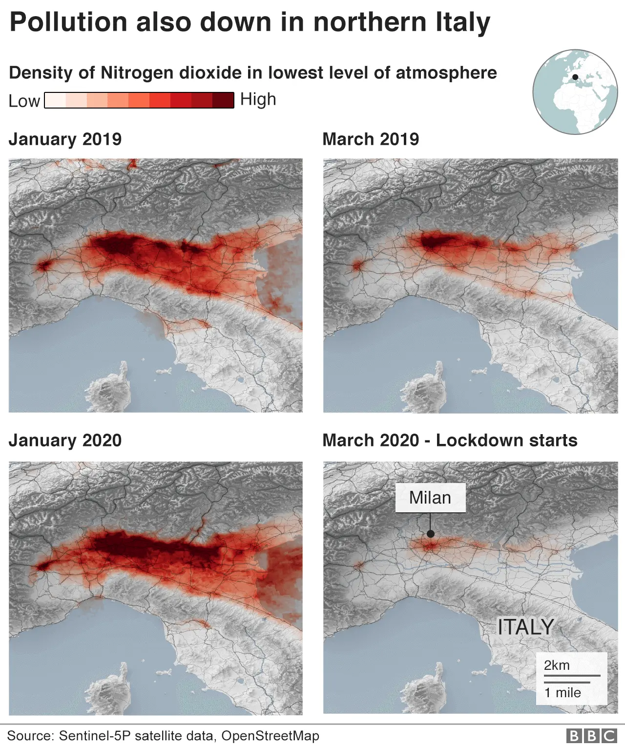
In the UK, and in many other places, the available satellite data does not yet show either way whether the ongoing reduction in economic activity is being accompanied by a corresponding fall in emissions, although some other sources suggest that it is.


How we're working
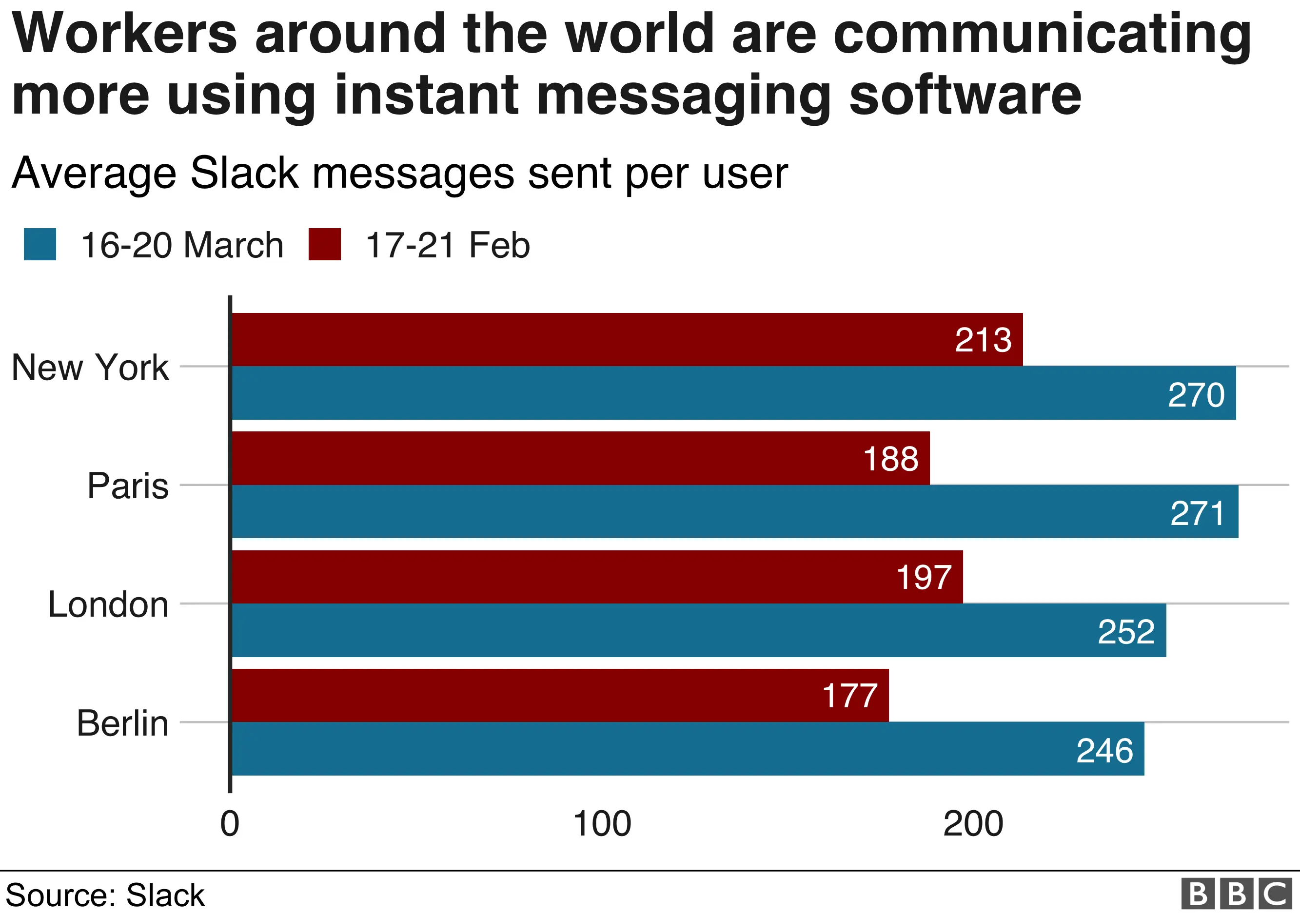
As countries have shut down, many workers have had to try to continue their office jobs from home.
That means video calls and instant messaging have become invaluable workroom tools.
The average number of messages sent by users in New York, Paris, London and Berlin has increased by more than a third in just a few weeks.
Not everyone has got used to their new ways of working just yet. But - depending on where you are - there could be a good deal of time left to do so.
By Daniel Dunford, Becky Dale, Nassos Stylianou, Ed Lowther, Maryam Ahmed and Irene de la Torre Arenas.
