US 2020 election: The economy under Trump in six charts
 BBC
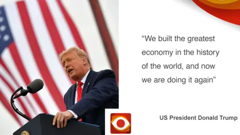
BBCClaim: President Trump says he built the greatest ever US economy prior to the coronavirus outbreak and that now it's recovering faster than ever.
Reality Check verdict: It's true the economy was doing well prior to the pandemic - continuing a trend which began during the Obama administration - but there have been periods when it was much stronger.
The US economy was then hit by the biggest economic contraction ever recorded as a result of the pandemic. It has since bounced back strongly, but hasn't regained all its losses.
We've looked at the economy in six key charts.


The latest numbers show economic output surged by an annualised 33% in the third quarter of 2020, following a record fall as a consequence of the coronavirus pandemic.
The recovery, although strong, hasn't yet brought economic activity back to pre-pandemic levels.
Mr Trump has said the recent recovery in growth is "the biggest in the history of our country by almost triple...that's bigger than any nation".
Yes, it is the biggest quarterly increase, but by more like double - outdoing the previous peak of 16.7% in the first quarter of 1950.
However, Mr Trump's comparison with other countries isn't right. From July to September this year, the economy grew by 7.4% in the US (33.1% is the annualised figure). This is less than Germany, Italy and the eurozone as a whole.
If you look at economic growth from the start of the pandemic to the present, the US has done better than Europe but "worse that China and some other Asian economies" such as South Korea, says Neil Shearing, chief economist at Capital Economics.

During his first three years in office, President Trump oversaw an annual average growth of 2.5%.
The last three years of the Obama administration saw a similar level of growth (2.3%).
Prior to the recent post-pandemic fluctuations, if we look at growth rates as far back as comparable records allow, it's clear there have been frequent periods when the growth of GDP - the value of goods and services in the economy - has been significantly higher than under President Trump.
In the early 1950s, for example, annualised GDP growth rate periodically exceeded 10%.


President Trump often highlights the rising value of US financial markets as a measure of success - in particular the Dow Jones Industrial Average.
The Dow is a measure of the performance of 30 large companies listed on US stock exchanges, and it reached record highs at the start of this year.
It then crashed as markets reacted to the coronavirus pandemic, wiping out all the gains made since President Trump took office.
But the financial markets have been remarkably resilient and have largely recovered back to near pre-pandemic levels, although there have been recent wobbles.


Prior to the pandemic, President Trump claims to have delivered the lowest unemployment rate in half a century.
This is true. In February this year, the rate stood at 3.5%, the lowest for more than 50 years.
However, the Obama administration added more jobs to the economy, comparing similar time-frames.
Under Trump, in the three years prior to the pandemic, there were an additional 6.4 million jobs. In the last three years under Obama, seven million jobs were added.
As in many parts of the world, coronavirus lockdown measures very quickly led to soaring levels of unemployment in the US.
The rate jumped to 14.7% in April, the highest level since the Great Depression of the 1930s.
The US Labor Department says more than 20 million people lost their jobs, eliminating a decade of employment gains in a single month.
Since the peak in April, unemployment has fallen back significantly to 7.9% in September.


Real wages (adjusted for inflation) grew throughout Trump's first three years in office - continuing a steady upward trend which began during the first of President Obama's two terms.
This growth reached 2.1% per annum in February 2019, prior to the pandemic.
This is lower than the real wage increases of up to 2.4% that President Obama oversaw in 2015
The rapid increase in average earnings then seen at the start of the coronavirus lockdown were largely as a consequence of the lowest-earning Americans losing their jobs at a disproportionate rate, following the economic downturn.
With lower wage-earners out of jobs, the average hourly wage data skewed sharply upwards.
Average wages have since started to fall back, as economic restrictions have eased.


President Trump claimed in 2019 that he had delivered "the largest poverty reduction under any president in history".
In 2019, around 4.2 million fewer people were living in poverty in the US compared with the previous year, according to official data.
This is a significant drop, but not the largest reduction in history.
The US Census Bureau has published this poverty data since the end of the 1950s. The largest fall in a single year was in 1966 during the administration of President Lyndon B Johnson, when almost 4.7 million people were lifted out of poverty.
The financial crisis of 2007/8 and subsequent economic downturn saw sharp rises in poverty, which only began to decline from around 2015 during the Obama administration, with a growing economy and rising levels of employment.
 Getty Images
The continued strength of the economy under President Trump (at least until the pandemic hit) has been matched by a continuing fall in the poverty rate.
This overall national figure masks wide variations across regions and ethnic groups in America. In 2019, while 10.5% of the population was defined as living in poverty, the figure for black Americans was 18.8 and for white (non-Hispanic) Americans it was 7.3%.
Figures for 2020 are not yet available, but are expected to show a sharp rise in poverty as a result of the pandemic.


