Coronavirus: Four numbers that reveal the real trends
 Getty Images
A run of seven consecutive days with falling case numbers is raising hopes about the beginning of the end of the pandemic.
Even notoriously cautious experts such as Prof Neil Ferguson are saying that by the autumn "the bulk of the pandemic" could be behind us.
But with Public Health England warning that "we are still in the third wave", how can you tell the blips from the real trends?
And what stats should you look at to know whether we might be getting close to the end?

1. The number of new hospital admissions
Daily case numbers get the most attention because they're the first to arrive.
But they're flaky. They depend on things that tell us nothing about the virus, like whether people decide to get tested or how quickly test results come back.
So scientists use other measures to check the story in the case numbers. These take longer to arrive, but give a clearer picture of the true trends.
Hospital numbers reveal a lot about where the pandemic is at the moment.
They tell us about the trends in sickness, as opposed to positive tests, and how much pressure Covid is putting on the NHS.
And the number of new admissions with coronavirus gives a better picture of the trends than the case numbers alone.
Experts have become much more confident that Scotland's fall in case numbers is real since they saw the hospital admissions follow suit a few days later.
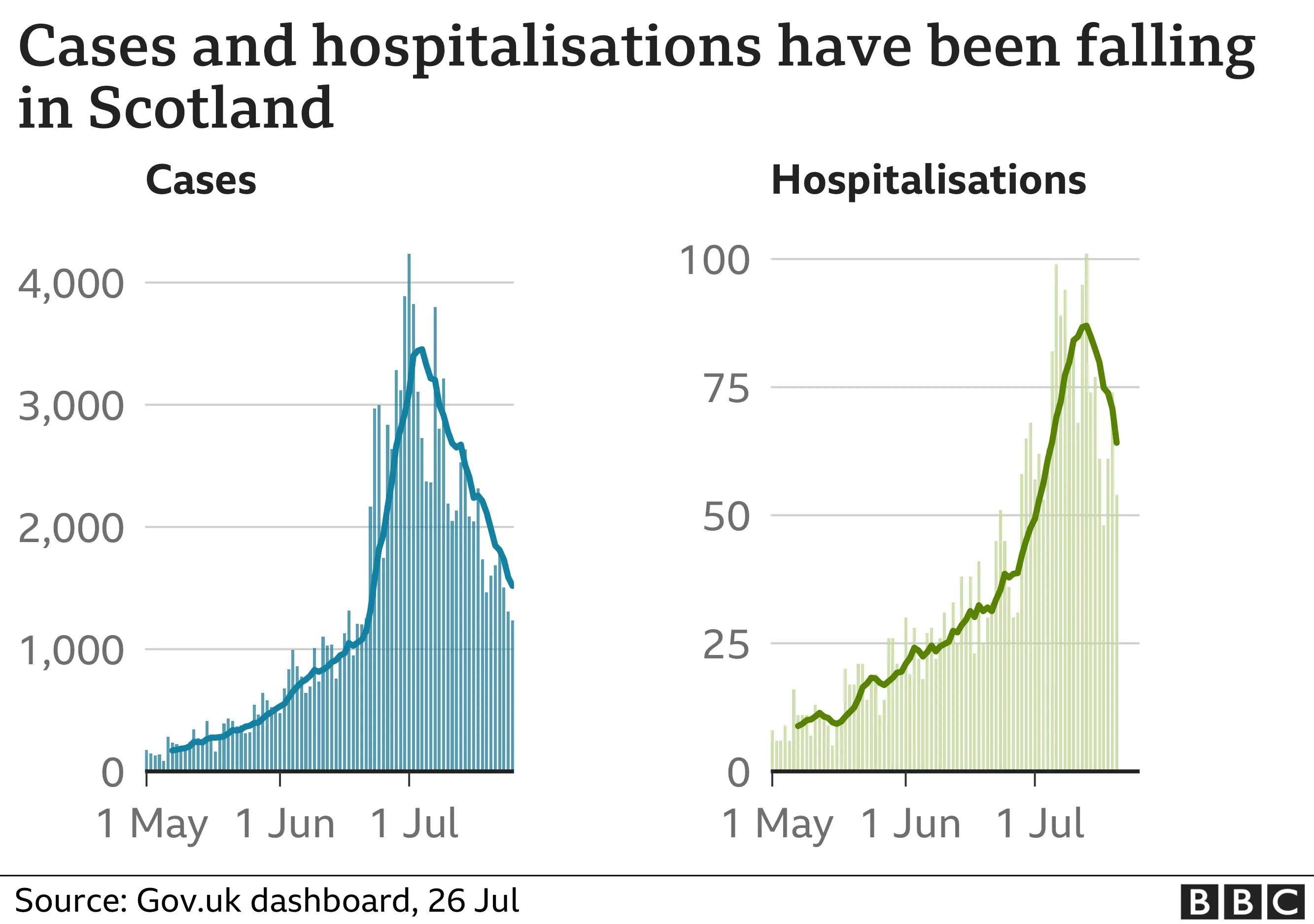
Admissions are still rising in the UK overall in the most recent data, but more slowly than a week ago and hopefully will follow Scotland's lead in the coming week.
2. The total number of infections
Every Friday, the Office for National Statistics says how many people they think have coronavirus.
They work it out by picking people at random and testing them every few weeks.
This means they catch the infections that never reach the daily case numbers when people don't get symptoms or don't get tested.
Their most recent data can't yet tell us about this week's falls as they were published a week ago and cover the week before that.
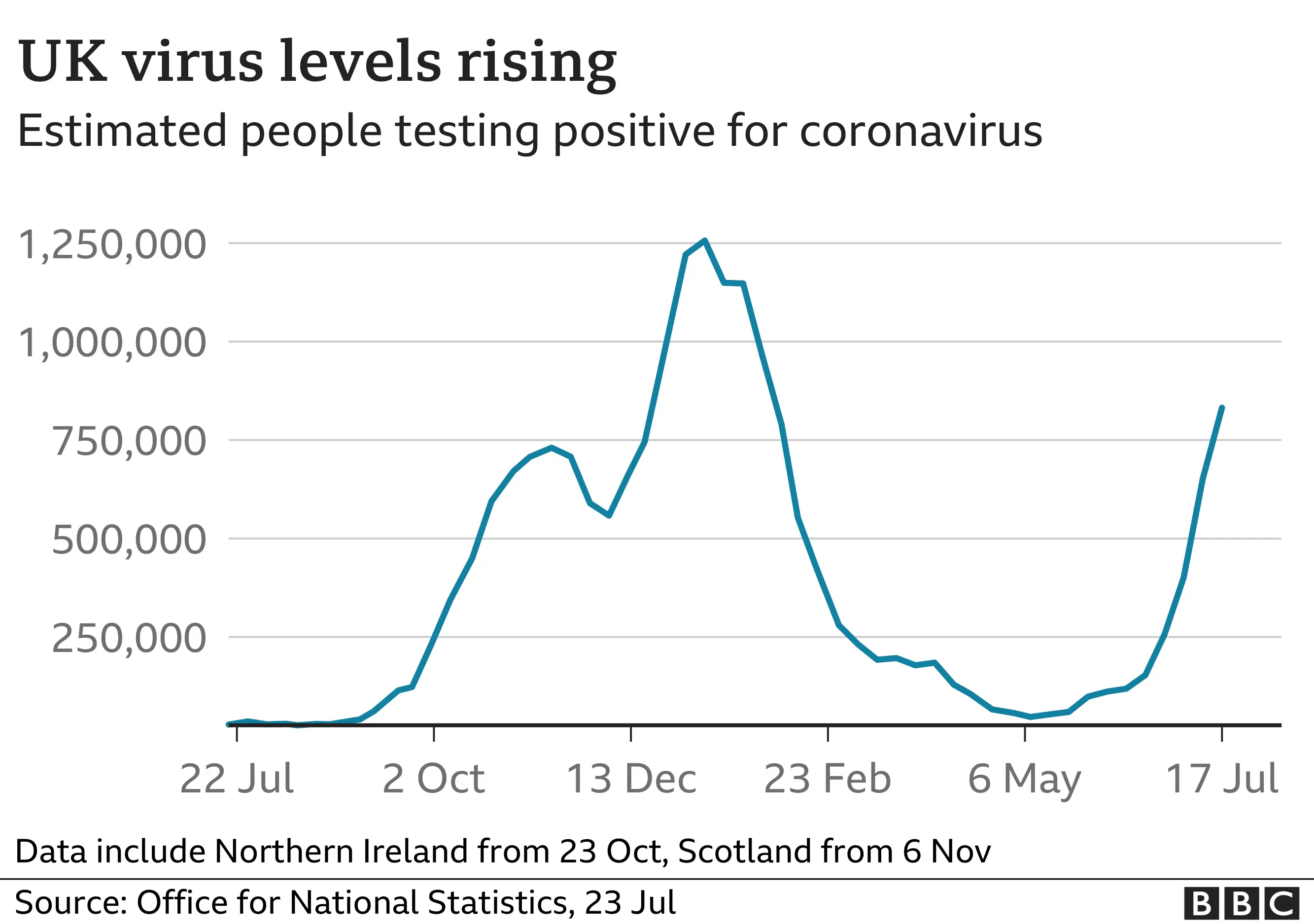
These figures aren't perfect. The tests they use are extremely sensitive and you can still test positive weeks after you've recovered from an infection.
So they capture people who, to all intents and purposes, no longer have coronavirus, which means the figures can take a while to spot a fall. But once they do, you can be pretty confident that the epidemic is shrinking.
But even if the epidemic is shrinking for real, will it keep on shrinking? You need to look elsewhere for clues.
3. The number of people double vaccinated
The hope is that, eventually, we'll have enough people protected to put the brakes on the epidemic for good.
Vaccination is doing the heavy lifting in getting us there at the moment.
More than 150,000 people every day are getting a second dose of the vaccine, far more than are being infected every day.
But that's going to slow down soon, which will mean that more protection will come the harder way: through infections.

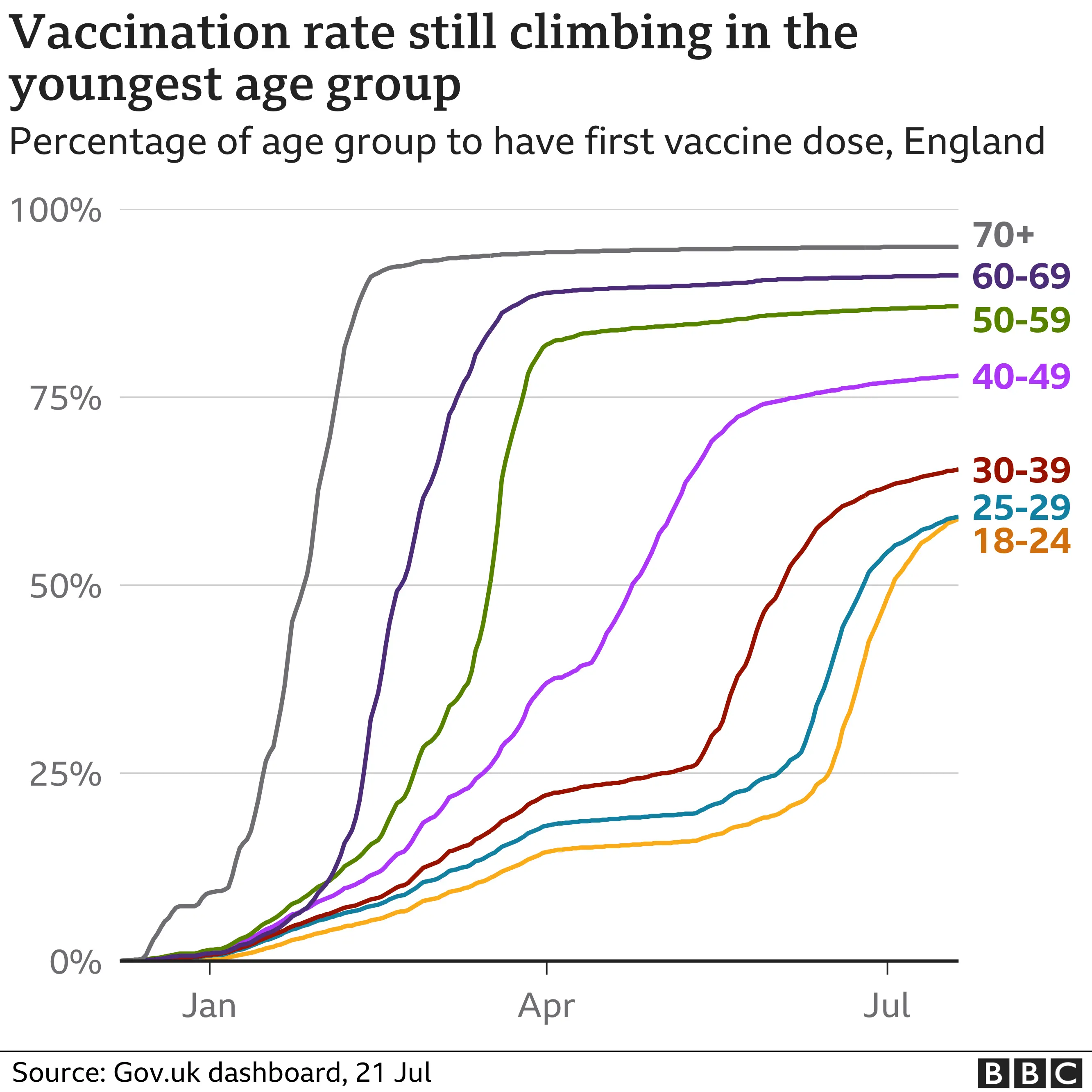
Fewer than 50,000 people a day are having their first dose right now. That sets a limit on how quickly we can grow double-dose protection in the future.
It looks like Gen-Xers and older millennials have topped out, with plenty of people in their 30s and 40s still to get their first dose. And younger adults are also starting to slow down.
4. The number of social contacts per person
The main unknown as we open up is how everyone will behave: will we party like it's 2019 or has the pandemic changed us for ever?
The models that talked about a peak of thousands of people going into hospital each day were trying to imagine a world where we all rushed back to our offices, and rapidly returned to socialising like we did before the pandemic.
So attention is turning to surveys that ask people about their social contacts. This data didn't matter as much when we weren't allowed to mix and so contact numbers were kept artificially low. But now we'll be watching them more carefully.
So far, there hasn't been evidence of a rush back. This survey tracks how many people we touch or talk to (face-to-face) each day.
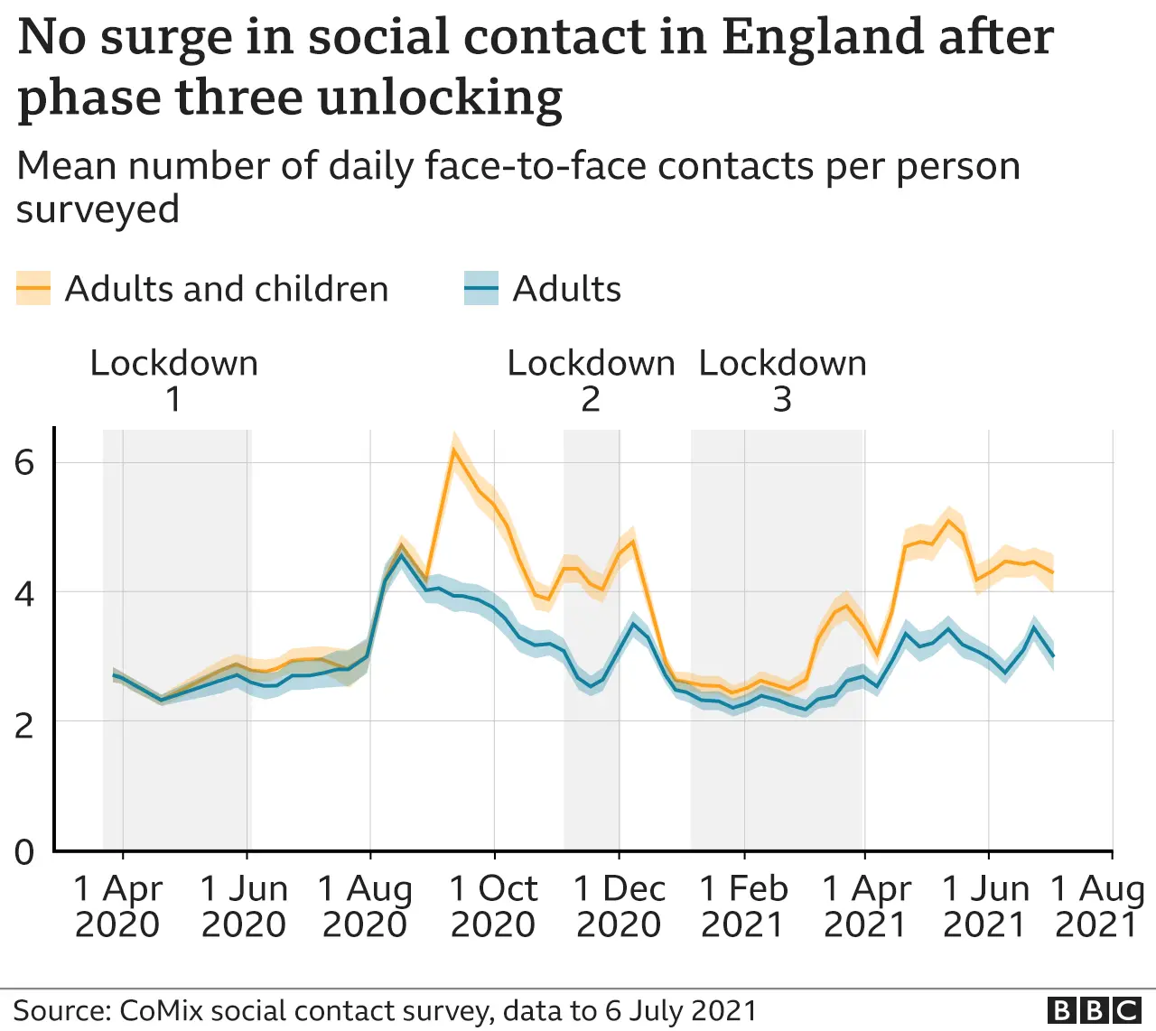
Before the pandemic, adults averaged 10 contacts a day. We don't have much data for July, but even in June, when most restrictions were lifted, adults were still averaging fewer than four contacts a day, far below pre-pandemic levels.
This suggests the return will be slower and offers hope that the worst-case scenarios envisioned by the government's models may not come to pass.
All these figures will give you a feel for the likely coming trends, but with all the competing effects of nightclub openings and school holidays still to play out, it's still a foolhardy person who would bet on the exact day the pandemic turns.
This article, published on 28 July, was amended on 14 October 2021 to make clear that the number of people in hospital with coronavirus is different to the number of people with Covid.

- CASES CHECKER: How many cases are there where you live?
- UK VACCINE ROLLOUT: How many people have been vaccinated?
- GLOBAL SPREAD: How many worldwide cases are there?
 y
y