A famous climate graphic is running out of red
 Northwest Passage Ocean Science Expedition/ Ramon Gonclaves
Scientists added a new shade to a graphical representation of global temperature change to keep up with our warming world. They are now adapting the idea to illustrate other environmental challenges.
Their journey had taken 115 days at sea, travelling 15,810km (9,823 miles) between Norway and Homer, Alaska. Along the way, the crew aboard the hand-built expedition sailing yacht Abel Tasman had threaded their way past the rugged coastlines of Iceland, Greenland and Canada before passing through the Bering Strait to their final destination.
Once impossible to cross, this sea lane between the Atlantic and the Pacific Oceans – known as the Northwest Passage – is becoming more accessible as the Arctic sea ice disappears, accelerated by a warming planet.
"It's wild. It's different. You don't know what to expect," says Keith Tuffley, owner of the Abel Tasman, environmental activist and leader of the expedition. He left a career in investment banking to embark on this adventure, as he'd always wanted to cross the Northwest Passage.
"I was keen to use this expedition to communicate and further explore the vulnerabilities of the Arctic to climate change," Tuffley says. "We need to communicate that this is destabilising the entire planet. Not many people live there, so it's sort of out of sight, out of mind. That's absolutely wrong."
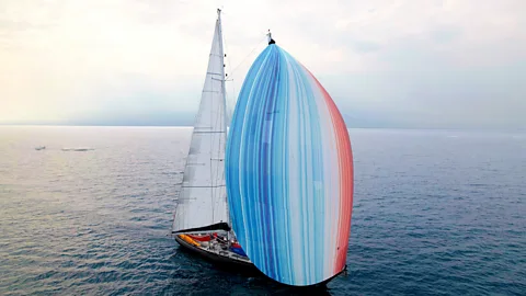
Back in January 2024, before embarking on the trip, he realised that one of his sails, the gennaker (a large downwind sail), needed to be replaced as it was falling apart. In a moment of inspiration, he had an idea.
"The climate stripes have always been something that impacted me, it's such a powerful image," he says. "It suddenly occurred to me, we should put them on the gennaker."
 Northwest Passage Ocean Science Expedition
The "climate stripes" – also known as the "warming stripes" – are a graphical representation of the changes in the planet's temperature over time since 1850, shown as vertical bars of colour. The pattern generally goes from blue shades to redder ones, illustrating how the planet has warmed as humans have emitted more greenhouse gases into the atmosphere.
Although it was not easy, Tuffley managed to get a custom-made sail with the climate stripes printed across it.
"It was a lot of fun sailing it," he says. "There's no other sail quite like this one, it's beautiful and has a great statement. We wanted to make people wonder about the story behind, and I think that's what's powerful about the climate stripes, you can create images that draw people in."
Tuffley says that one of the most striking days for him was travelling across the Disko Bay in western Greenland, where its biggest glacier meets the sea. The Greenland ice sheet is melting, and the rate of ice loss has increased six-fold since the 1980s. Both glacial and sea ice melt are contributing to an enormous amount of freshwater into the ocean, with global implications.
"It just so happened that when we were crossing that Bay, it was actually the hottest day ever recorded," he says. "We realised that we were seeing and hearing a melting planet. It really was beautiful seeing all these icebergs melting, but it was also sad."
That day – 22 July 2024 – was the hottest day on record, according to a Nasa analysis of global daily temperature data.
Although it may feel distant, the Arctic plays an important role regulating the global climate, and it is warming faster than the rest of the world, with consequences for marine ecosystems, sea levels and food security. The warming of the Arctic also affects belts of wind known as the jet streams while melting ice alters ocean currents, leading to further changes in the Earth's climate, especially in the Northern Hemisphere.
Earlier in 2024, the climate stripes were updated with an extra colour at both ends – a darker blue and a darker red. The reason was that 2023 was so hot that the team behind the stripes at the University of Reading, in the UK, decided to change the scale.
But it is already looking likely that temperatures will outstrip the scale again if the current trend continues. The boreal summer for 2024 (June to August) was the warmest on record globally. It has raised concerns that average surface air temperatures for 2024 will surpass those seen in 2023 to become the hottest year since records began.
If this happens, then the stripe for 2024 will be the darkest red on the updated scale, says Hawkins.
Some scientists believe that recent extreme weather events have been worsened by climate change. One study from the Lawrence Berkeley National Laboratory estimated that global warming may have caused over 50% more rainfall during Hurricane Helene in some parts of the US, while the World Weather Attribution group reported that climate change was a key driver of the hurricane's catastrophic impacts. Similar statements were made about Storm Boris, which caused damage in Eastern Europe, Austria and Italy.
More like this:
• What is the 1.5C threshold and why is it important?
"We're warming the planet through our actions, and it's causing these types of events to become more severe and more common, causing financial damages, deaths and misery for millions of people," says Ed Hawkins, a professor of climate science at the University of Reading who created the climate stripes graphic. "And it's only going to get worse until we manage to stop the planet warming."
The climate stripes are also being reimagined to help illustrate other crises facing the planet. Not all have a negative story to tell either.
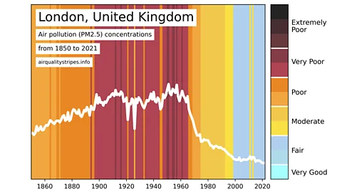
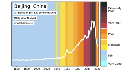
The "air quality stripes" for major cities around the world, show outdoor concentrations of particulate matter (PM2.5) air pollution from 1850 to 2021 based on satellite data and climate models. In some major cities the stripes show how air quality has actually improved as measures to tackle air pollution have taken effect. But there are still many where the air has worsened.
 Airqualitystripes.info
"We were very much inspired by the climate stripes because they are a very effective tool for messaging," says Kirsty Pringle, an atmospheric scientist at the University of Edinburgh, UK, and project manager of the air quality stripes, which launched in August 2024. After testing different styles and asking for feedback, they decided on a version that uses colour stripes, but with additional layers of information such as a legend with air quality ratings (ranging from 'very good' to 'extremely poor'), an average concentration line and in some cases annotations of historical context.
"The response overall has been really positive," Pringle says. "I certainly don't think we would have received as much interest if we had just done a series of line graphs, without them being visually striking as well as informative."
Pringle believes that by now many people are familiar with the climate stripes, which helps those outside the academic community quickly understand the message they convey. But they also demonstrate some of the subtleties in the challenges facing many areas.
"Whereas the climate stripes have a very simple, global message that the Earth is warming, the air quality stripes have a more complex message, in that you have some cities where the air is getting cleaner, and other cities with increasing pollution," she says. "So we have two different stories depending on where you are."
 Airqualitystripes.info
Another notable distinction with air quality, Pringle says, is that we already have a lot of the solutions and it is easier to address than climate change.
"It's a really fixable problem," she says. "Acting on climate change is obviously very urgent, but with air pollution you have the benefit that if you take steps, you will see the effect relatively quickly."
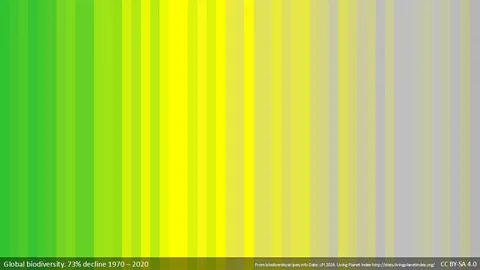
Another variation are the "biodiversity stripes", which in a similar manner use bars of colours to show the loss of biodiversity over time, mainly going from green to grey.
Miles Richardson, who leads the nature connectedness research group at the University of Derby in the UK, was troubled that biodiversity loss gets less coverage than other global issues. Richardson was familiar with the climate stripes and thought it would be good to do a version for biodiversity since nobody had done them.
 biodiversitystripes.info/LPI 2024
"There's a battle for attention every day, especially if you live in an urban environment. But the stripes format seems to breakthrough and grab people's attention," he says.
He found biodiversity data, spoke with ecologists, consulted with other experts, and released them in 2022. He wanted the stripes to represent the data and engage people to get a message across about the decline of biodiversity around the world.
"They became very popular. Within three months they went global, which I think speaks to the power of the stripes format. People get it," says Richardson. "I think both the climate and the biodiversity stripes show the symptoms of a failing relationship with nature. That's the underlying cause, and we need to change that."
For Tuffley, that change is possible, but it requires a shift in mindset to view the problem as an opportunity.
"We do have a battle on our hands with this, but we can create huge economic and social change by addressing these challenges," he says. "If we get inspired, then we can create positive energy and we can solve this, but each of us has a role to play."
In the meantime, the Abel Tasman yacht is out of the water for the winter, but next year Tuffley intends to unfurl the climate stripes sail again to continue spreading their message.
--
For essential climate news and hopeful developments to your inbox, sign up to the Future Earth newsletter, while The Essential List delivers a handpicked selection of features and insights twice a week.
