The toxic colour that comes from volcanoes
 Museo de Arte de Ponce. The Luis A. Ferré Foundation, Inc.
For centuries, the orange pigment was sourced from a toxic mineral. Kelly Grovier looks at a hue that alchemists believed was crucial to creating the Philosopher’s Stone – and which allows art to swivel between different states of being.
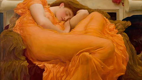
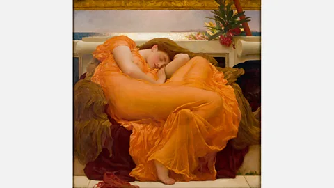
Expunge orange from the history of art and the whole thing collapses. The sky above Edvard Munch’s The Scream falls down and the fire that ignites Frederic Leighton’s famous Flaming June flames out. Take away orange, and everything from the warm eternal glow of Egyptian tomb painting to the troubled stubble of Vincent van Gogh’s smouldering self-portraits vanishes. A savvy arbiter between resolute red and unyielding yellow, orange is a pigment that pivots. It’s a hinge of a hue that enables a work of art to swivel between contrary states of being – this world and another, life and death.
 Museo de Arte de Ponce. The Luis A. Ferré Foundation, Inc.
Outside the frame of art history, orange has proved an unusually elastic symbol, blossoming into a spectrum of shapes and cultural meanings. Although the influential European royal House of Orange traces its name back further than the actual coining of the colour in the 1540s, its prominent son, William III (better known as William of Orange), quickly embraced the linguistic coincidence in the 1570s. His orange-white-and-blue rebel flag would become the forerunner of the modern tricolour of The Netherlands. From there orange took on the complexion of everything from Swiss fire engines to the suits worn by astronauts in the International Space Station. But it’s in the realms of art and aesthetics that the colour has fructified more soulfully.
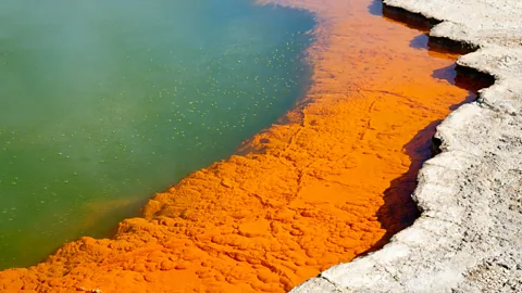
From antiquity to the end of the 19th Century, a volcanic mineral found in sulphurous fumaroles (great gashes in the Earth’s crust) was a significant source for the harvesting of orange pigment. The highly toxic orpiment, rich in lethal arsenic, ripens from mellow yellow into outrageous orange when subjected to the heat of a fire.
 Alamy
AlamyConvinced that the luminous shimmer of orpiment (its name is a contraction of Latin aurum, meaning ‘gold’, and pigmentum meaning ‘colour’) must be a key ingredient in concocting the Philosopher’s Stone, alchemists for centuries risked exposure to the noxious substance. So did artists. To dabble in the occult of orange was to flirt with mortality and immortality in equal measure.
A spark to a flame
Intentionally or not, that ambiguous aura is irrepressible wherever orange is conjured in art. Take for example the French Rococo painter Jean-Honoré Fragonard’s portrait of a generic writer captured at a moment of intense vision: Inspiration, painted around 1769. The poet’s plush orange jacket – its vibrant rumples flickering like flares – threatens to engulf the allegorical subject of a poet whose imagination has just been ignited. The furrowed velour has become an outward reflection of the writer’s mind. This evaporative moment of reverie that illuminates the subject, as if from inside his soul, will either ensure his eternal fame as a celebrated bard or will set on fire his very being. Fashion him in any other colour than orange and the work’s flustering power would be utterly lost.
 Alamy
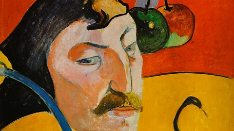
AlamyNor is it possible to imagine Self-portrait with Halo and Snake, painted by the post-Impressionist Paul Gauguin more than a century after Fragonard’s canvas, soaked in any other colours than the two competing complexions of orange that dominate and divide its radiant surface into competing territories of piousness and malevolence. Created by Gauguin while living in the North-western French fishing village of Le Pouldu, the work portrays, in its upper half, a saintly indifference to worldly temptations, as symbolised by a dangling sprig of forbidden fruit. To make certain we don’t miss the unmissable point, the artist has crowned himself in this hemisphere of the work with an angelic halo. The lower half of the wood panel, however, reveals an uncontainable susceptibility to evil as the seductive snake from the Garden of Eden has the artist wrapped around his proverbial finger. Tying the work together tonally is a dramatic shift at its equator in shades of orange – not unlike orpiment itself, before and after its purifying baptism by fire.
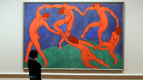
And so it goes, work by work, century after century: wherever the colour orange dictates the temperature of a work of art, we know we’ve arrived at a precarious hinterland between a universe we can see and a mysterious unknown we tentatively feel. How else can you characterise the realm in which the liquified face of Munch’s hero howls under a strange and estranging burnt-cinnamon sky in The Scream? How else can you describe the eternal space in which Henri Matisse’s iconic The Dance whirls apocalyptically on the edge of oblivion?
 Getty Images
Commissioned in 1909 by a wealthy Russian businessman to adorn the staircase of his mansion, at first glance The Dance might appear the apotheosis of rhythmic delight and synchronised levity. But the eerie apricot tinge of the five ecstatic nudes, who seem to have subsumed into their very being the armageddon orange of Munch’s work, is a tip-off that something more complex and perilous is at play. The two dancers who stretch the foreground of the work have lost their grip on each other’s hands, as the one closest to us begins slipping to the ground. Her left foot is already sliding out of view. Far from depicting untroubled joy, Matisse’s carefully choreographed masterpiece teeters on cosmic disaster. The very rotation of the world is left dangerously in doubt.
Amber alert
Munch and Matisse set the tone, as it were, for the portentous temperament of orange in modern and contemporary art. Throughout the 20th Century, the ominous refulgence of orange will find itself refracted variously in the works of everyone from Francis Bacon, where it sets the sinister scene for the disturbing Three Studies for Figures at the Base of a Crucifixion (1944), as well as Rene Magritte’s Art of Living (1967), where the colour inflates itself to popping point as a surreal cranium. The syncopated pigments and shudders of Rhythm, joy of life, painted in 1931, is characteristic of how crucial orange is to the work and imagination of the Ukrainian-born French artist Sonia Delauney, who once protested: “You know I don’t like orange”. Like it or not, orange is frequently the heat that holds together – while threatening to break apart – the visual music of her sinuous mosaics.
 Getty Images
As crucial as orange has been to the story of art through the end of the last century, it has already dyed itself indelibly into the unfolding fabric of contemporary artistic consciousness. Among the most celebrated major works of the new millennium, The Gates, by Bulgarian artist Christo Yavacheff and French artist Jeanne-Claude (known together as Christo and Jeanne-Claude), colonised New York City’s Central Park in February 2005 with over 7,500 passageways – each flowing with orange nylon fabric. The lyrical succession of thresholds, which fostered a poetic sense of the endless comings and goings of life – birth and rebirth, mortality and eternity – could, on reflection, have only been draped in stirring saffron. To some, the colour echoes the robes of Buddhist monks. But to my mind, Christo and Jeanne-Claude (who passed away four years later) were rekindling a sacred flame, inviting those who would come to bask their weary souls in the transformative power of that most mystical of ancient tints: orange.
If you would like to comment on this story or anything else you have seen on BBC Culture, head over to our Facebook page or message us on Twitter.
And if you liked this story, sign up for the weekly bbc.com features newsletter, called “If You Only Read 6 Things This Week”. A handpicked selection of stories from BBC Future, Earth, Culture, Capital and Travel, delivered to your inbox every Friday.
