The mysterious painting that changed how we see colour
 Yale University Art Gallery
Marcel Duchamp’s last painting has influenced artists for a century. Kelly Grovier looks at how it inspired the modern colour chart – and at its 17th-Century predecessor.
This year marks the centenary of one of the more curious milestones in modern cultural history – a landmark in image-making with intriguing echoes of a long-forgotten tome from the 17th Century. In 1918, the French avant-garde artist Marcel Duchamp picked up his brush after a four-year hiatus from painting and created a mysterious work that changed forever the way artists use and understand colour. After completing his painting, Duchamp put his brush back down again and, for the next 50 years (until his death in 1968), never painted another picture.
More like this:
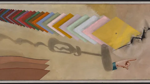
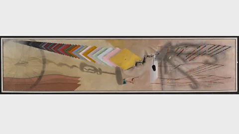
The work in question is awkwardly proportioned – over 3m (9.4ft) long, yet barely two-thirds of a metre tall – and was commissioned to hang above a bookcase in the library of the US collector and patron of the arts Katherine Dreier. At first glance, the canvas (which Duchamp eccentrically entitled T um’, a terse abbreviation of the tetchy French phrase tu m’ennuies, or ‘you bore me’) appears to do everything it can to be something other than a painting. Its surface is dominated by shadowy allusions to a series of controversial sculptures that Duchamp had recently been making – found objects such as a hat rack, a corkscrew, and a bicycle wheel – that he christened ‘readymades’.
 Yale University Art Gallery
In stark contrast to these large ghostly echoes of another artistic medium, a scatter of worldly debris is strewn across the painting: safety pins, a bolt, and a brush for cleaning bottles. According to Yale University, “Duchamp summarises different ways in which a work of art can suggest reality: as shadow, imitation, or actual object.” Stretching over this odd array of forms is a carefully-rendered cascade of colourful lozenge-shaped tiles that swoop vibrantly into the centre of the painting from the top left, like the tail of a mechanical polychromatic comet.
Anyone who has ever shopped in a DIY store for domestic paint will recognise immediately this splay of colour tiles. But in 1918, pigment samples from commercial colour charts were still relatively cutting-edge in their retail trendiness, having only hit shop floors towards the end of the previous century. As yet unassigned to an actual object, these ‘readymade’ swatches of colour are at once both physical and theoretical; they haver between the real world of things waiting to be painted and a realm of pure mind in which those things can still be any colour.
A pigment of our imagination
In a sense, this endless deck of dyes bursting into the middle of Duchamp’s painting is a Tarot of tincture, prescient of how things could eventually appear in an ideal world, not as they actually are. Though Duchamp’s tiles are merely a prophecy of hue, they seem somehow more real and urgent in his painting than the shadowy shapes of the hat stand, bicycle wheel, and corkscrew whose space they intersect cosmically, as if from another universe.
The years and decades that followed Duchamp’s final painting witnessed a succession of works by modern and contemporary artists that wrestle with and absorb the implications of his mischievous slicing of the mere idea of colour from the fact of physical form. Where proponents of colour theories of the 19th Century, such as those by the German Romantic Johann Wolfgang von Goethe and by the French chemist Michel Eugène Chevreul, are concerned with how colours are perceived by the human retina, the disciples of Duchamp became obsessed instead with colour as a commercialised concept – a pigment of their imagination.
 Yale University Art Gallery
At the same moment that descendants of post-Impressionism and the early pioneers of Expressionism were formulating quasi-scientific manifestos for how colour functions in the eyes of those who encounter their work, Duchamp was laying his new-fangled cards on the table: colour is an aspirational commodity – a property to be found, not an emotion to be felt.
Titians of industry
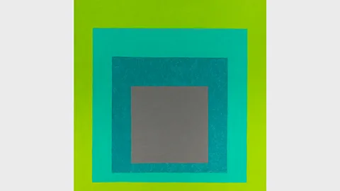
Suddenly, two philosophies of colour found themselves competing for artistic regard – one that understood it as a traditional tool of the craftsman to be soulfully mastered, the other that saw it as an artificial aspect of soullessly manufactured goods. That clash of sensibilities was perhaps most dramatically illustrated by the near-simultaneous appearance in 1963 of two very different kinds of publication. It was the year that the German-born American artist Josef Albers released his still-influential visual treatise, Interaction of Colour, which provides complex ruminations on the harmony of hues – a system that continues to be taught to this day. It is also the year that Pantone published its encyclopaedic compendium of subtle shades – a volume that appeared to prove the dominion of industry over the empire of conceivable colours.
 Alamy
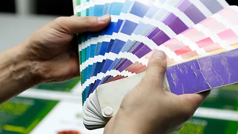
AlamyThe sway over artistic imagination in the 20th Century of the Pantone colour-matching system, and its precursors in the pigment charts distributed by companies such as DuPont, is impossible to overstate. Their influence can be traced in the works of generations of artists from Andy Warhol to Damien Hirst, Ellsworth Kelly to Gerhard Richter. But if Duchamp’s echelon of mechanical colour stretches prophetically forward in time to the obsessions of everyone from the Pop Artists to the YBAs, it also stretches back in history to the preoccupations of one of the most extraordinary, and extraordinarily neglected, books ever created.
 Getty
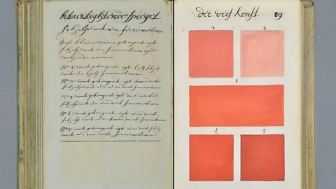
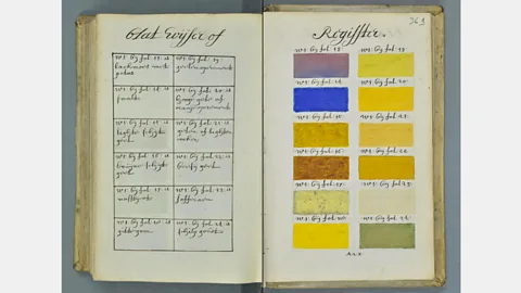
GettyLong forgotten until its rediscovery in recent years by Medieval and Renaissance scholars, Klaer lightende Spiegel der Verfkonst is an 800-page handwritten and hand-illustrated volume from 1692 that seeks not only to illustrate every conceivable shade of watercolour possible, but to explain how to create them. An obsessive-compulsive recipe book for concocting the subtlest variations of tint, the book is the brainchild, according to the title page, of ‘A. Boogert’ – a Dutch hustler of hues about whom nothing else is known.
 Aix-en-Provence, Bibliothèque municipale/Bibliothèque Méjanes
Boogert’s book, which the inscrutable author says was intended to assist artists, came to the attention by accident of a Dutch Medievalist and blogger who was conducting research on the online databases of the Bibliothèque Méjanes in Aix-en-Provence, France, in 2014. Erik Kwakkel’s decision to feature the vibrant volume on his popular scholarly blog, and to provide links to a high-resolution scan of the entire book, helped propel the lexicon of luminosity into wider recognition than the single-surviving copy could ever have enjoyed in the author’s own lifetime.
 Aix-en-Provence, Bibliothèque municipale/Bibliothèque Méjanes
To click through the digitised pages of the book and watch the hundreds of abutting tiles flick into a shuffled blur of calibrated colour is to find oneself enacting the geometric drama of Duchamp’s pivotal final painting. Speaking to each other across centuries, Boogert’s long-lost opus maximum and Duchamp’s underappreciated prophetic masterpiece reveal a perennial fascination with the mysterious disguises of life’s most elusive dimension: colour.
And if you liked this story, sign up for the weekly bbc.com features newsletter, called “If You Only Read 6 Things This Week”. A handpicked selection of stories from BBC Future, Culture, Capital and Travel, delivered to your inbox every Friday.
